I love natural wood tones, like the rich mahogany of our bed and the bleached driftwood shade of Scandi furniture. This means that brown never disappeared from my interiors. But this season, brown is back as a gorgeous paint color for our walls and cabinetry.
The best light brown paint colors are Manchester Tan, Tavern Taupe, Happy Trails, Chocolate Mousse, and Mouse’s Back. Mid-tone browns are Safari Beige, Woven Wicker, Brown Clay, Nutshell, and Muscovado. Rich darks include Salon’s Drab, Sealskin, Bittersweet Chocolate, Tanner’s Brown, and Caponata.
The Appeal of Brown Paint Colors
If you think brown is boring, you’re in for a delightful surprise. Think quiet luxury, coastal grandma, or dark academia. The options for brown are endless, and premier paint brands have delivered.
The joy of brown is its versatility; the palest shades are close to beige. And the moodiest dark shades are almost black. There is a brown hue for every room. You can layer natural neutrals in a Boho palette or go dramatic in a chocolate brown man cave.
Let’s look at the best browns this season has to offer.
The Best Light Brown Paint Colors
The lightest brown is beige, which has a cooler tone than the next shade, tan. Other pale browns are natural bone, stone, and sand hues, perfect for coastal palettes.
#1. Manchester Tan HC-81 by Benjamin Moore
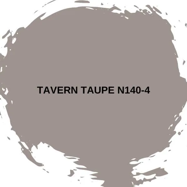
One of Benjamin Moore’s most popular colors, Manchester Tan. It is a beige with gorgeous warm sandstone tones. This is the perfect neutral for open-plan homes or lofts. It can connect living rooms to kitchens and dining rooms. It stays fresh and appealing, never dull.
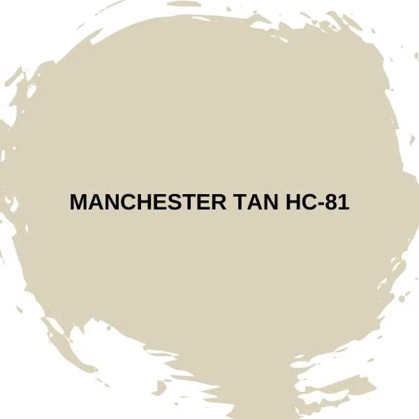
#2. Tavern Taupe N140-4 by Behr
Taupe is a lush version of brown with unusual pink undertones. It’s a luxurious color, ideal for chic, sophisticated interiors. You can use it in bedrooms or dining rooms, instead of the chilly grays that have been so popular.
Tavern Taupe is the ideal background color for a timeless, quiet, luxury ambiance.
#3. Happy Trails PPG1084-4 by Glidden
This is a Glidden fan favorite for creating a harmonious, tranquil effect. Happy Trails is a honey-colored brown. It glows with warm-toned woods and other natural textures. These include wicker, jute, and seagrass. It’s the ideal anchor shade for a serene Boho interior — layer on the macrame dream-catchers.
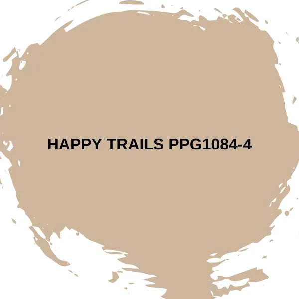
#4. Chocolate Mousse 1025 by Benjamin Moore
Another luscious neutral, Chocolate Mousse has a velvety texture and antique rose undertone. I’d categorize this color as cashmere, a little lighter than taupe and much cozier than beige. Pair Chocolate Mousse with crisp white bedding in a peaceful, laid-back bedroom.
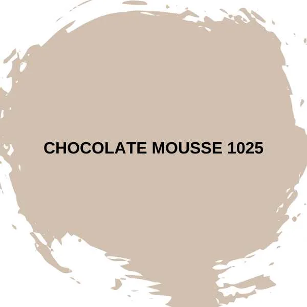
#5. Mouse’s Back 40 by Farrow & Ball
This is the brown for you if you don’t like heavy chocolate. British fieldmice inspired the charmingly named Mouse’s Back. They have brownish-gray pelts.
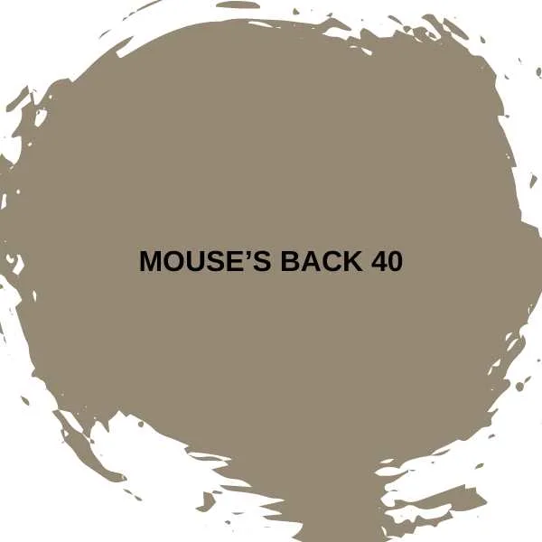
The fawn color leans slightly green, a freshness that prevents it from becoming too muddy. So you can still use it in cooler, north-facing rooms. This muted mushroom color is lovely for kitchen cabinets, paired with creams. It also looks great in a peaceful home office with warm plaster whites.
The Best Medium Brown Paint Colors
Mid-toned browns are underrated stalwarts of home interiors. Yes, they got a bad rap in the seventies, let alone the “brown is the new black” business of the nineties.
You can happily use these rich browns, as the latest paint colors don’t hark back or provide a retro look. Here are my top five medium brown paint colors.
#6. 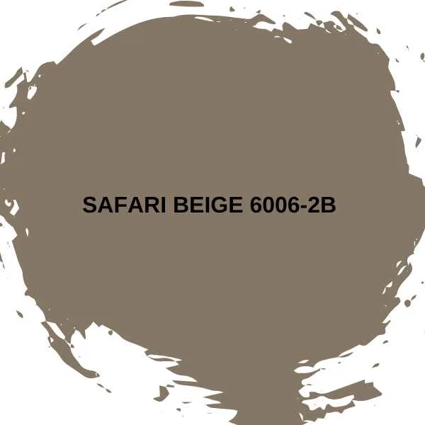
Safari Beige is a rich-toned beige. It adds warmth and grounding to any environment, even a light-starved room.
This earthy shade works well in trending organic modern or biophilic interiors. It’s especially nice with terracotta yellows, reds, and oranges. Or add fresh white accents if you don’t want a look that is too rustic.
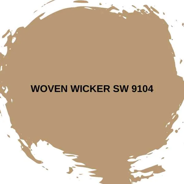
#7. Woven Wicker SW 9104 by Sherwin-Williams
This clay-brown terracotta has a warm orange undertone. It pairs well with other earthy colors like deep red, muted blue, and sage green. Woven Wicker goes well with warm woods, stone cladding, leather sofas, and Persian carpets. It’s suitable for a cozy living room or an English-inspired study.
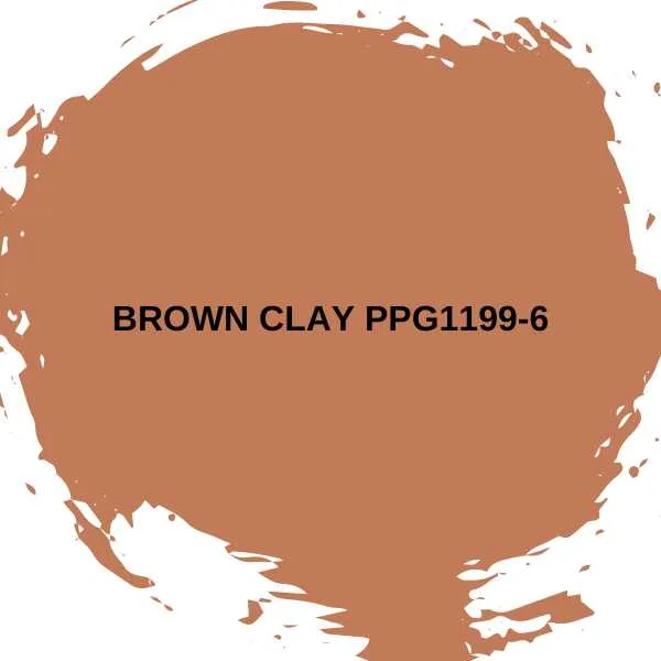
#8. Brown Clay PPG1199-6 by Glidden
Brown Clay is a spicy sienna with a hearty dose of orange — it’s a true terracotta with a hint of pumpkin spice. Pair Brown Clay with cinnamon, saffron, gold, and brass for a nod to the souks. I love Brown Clay in inviting living rooms, cozy kitchens, or sunny porches.
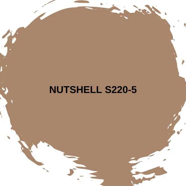
#9. Nutshell S220-5 by Behr
From fieldmice to squirrels. Nutshell’s brown is like a roasted walnut. It always makes me think of Beatrix Potter’s playful, red-tailed Squirrel Nutkin. Use Nutshell to anchor a South-Western or desert-inspired color palette. Add a lot of greenery, for a cozy, inviting interior.
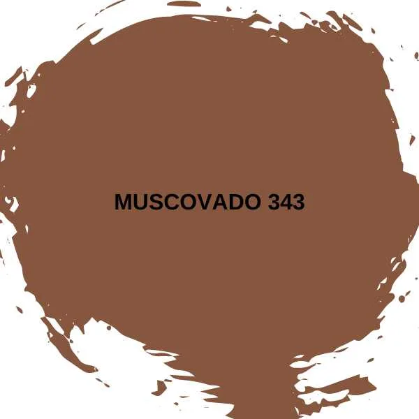
#10. Muscovado 343 by Little Greene
Little Greene’s Color of the Year 2024 embraces the entire Sweet Treats palette. This consists of the honey, caramel, and chocolate shades of traditional desserts. My favorite of the nine, Muscovado, is a mid-toned gingery brown. It’s a rich, indulgent shade ideal for fall color schemes.
Don’t be limited to the reds, yellows, oranges. I’ve expanded my fall palette to include charcoal, moss, pumpkin, berry, and olive.
The Best Dark Brown Paint Colors
Looking for the ultimate moody yet cozy shade? Consider chocolatey dark browns. They are easy to live with and go well with cool and warm colors.
#11. Salon Drab 290 by Farrow & Ball
Despite the name, Salon Drab is not a dull color at all. It’s a rich chocolate brown that works well in weathered farmhouse and country-style interiors.
This warm-toned dark brown works well with a creamy, neutral palette. It also goes well with earthy-toned olive, rust, taupe, and gray.
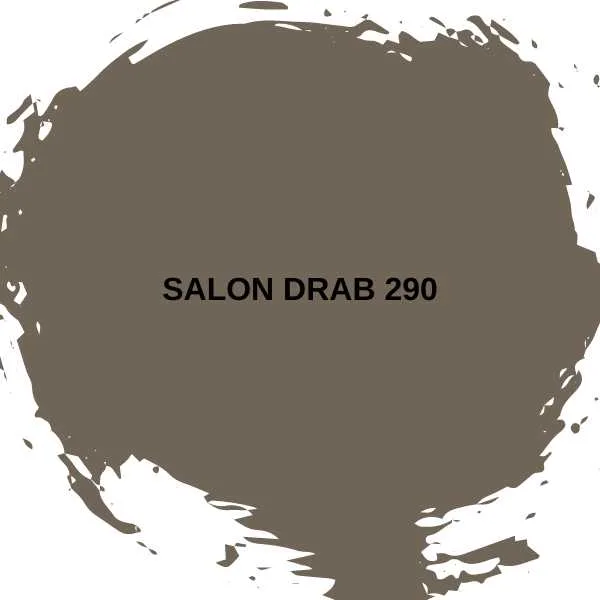
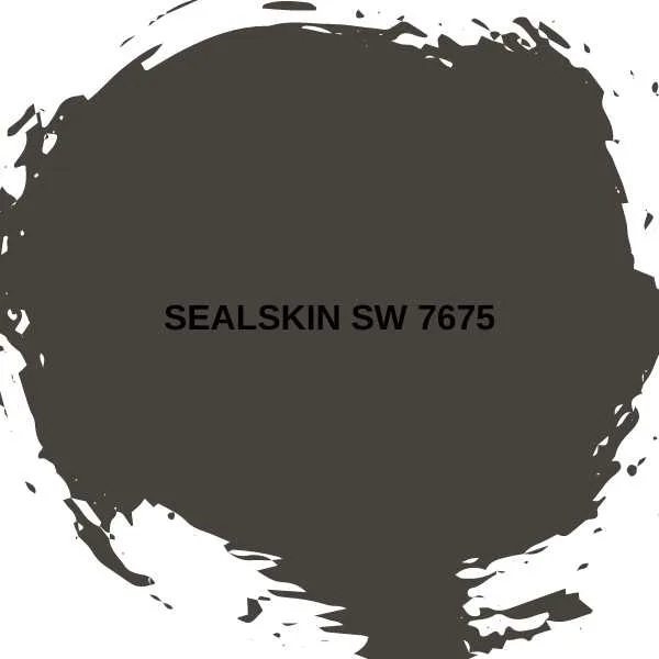
#12. Sealskin SW 7675 by Sherwin-Williams
Sealskin is a deep, saturated brown. I love it for a cozy bedroom. It pairs well with coffee shades of latte and cappuccino.
Use Sealskin in a well-lit study for dark academic vibes. Add saddle-brown leather and dark-wood bookcase. Or embrace a cave-like bedroom sanctuary by drenching your walls in dark brown.

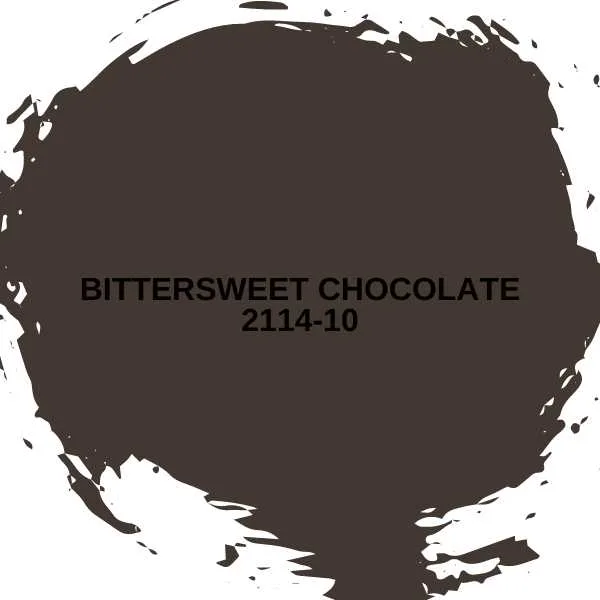
#13. Bittersweet Chocolate 2114-10 by Benjamin Moore
Black can be a daunting shade for interiors. So, try Bittersweet Chocolate instead. This intense espresso brown has a violet undertone, adding depth and elegance.
Bittersweet Chocolate is a dramatic moody color. It is easy to use for an accent wall or with crisp white in a bathroom. It’s also ideal for minimalist interiors as it can replace black in a scheme with gray and white accessories.
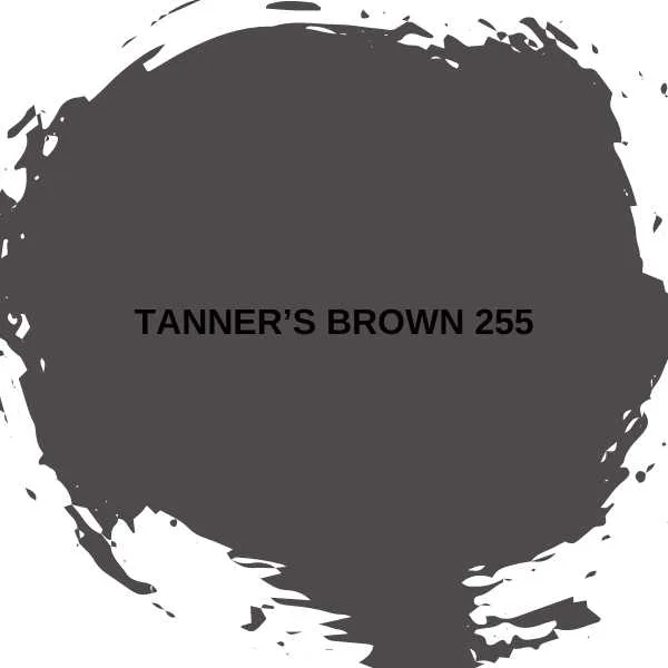
#14. Tanner’s Brown 255 by Farrow & Ball
Tanner’s Brown is Farrow & Ball’s darkest shade. Choose this shade for a saturated brown that reads black in lower lighting. In a sunny, light-filled bedroom, the warm red undertone adds coziness to a coffee-and-white palette. This deep color is also gorgeous with bold accents.
#15. Caponata AF-650 by Benjamin Moore
Caponata’s unusual color is at the intersection of eggplant and brown. It’s a rich chocolate with strong purple undertones. This lush color is warm and heavy. It is beautiful when paired with maroon, burgundy, and other jewel tones.
Final Thoughts
Choose light brown as an alternative to white. Mid-tone brown instead of blue, and dark brown instead of black or charcoal. You’ll have added warmth, comfort, and a surprisingly easy color to live with.
Related Paint Color Resources:
- Top 16 Blue Paint Shades
- Top 13 Blue Green Paint Shades
- Top 12 Black Paint Colors
- 12 Best Earth Tone Paint Colors
- 16 Paint Colors that Go Well with Dark Wood Trim
- Top 12 Red Paint Colors
