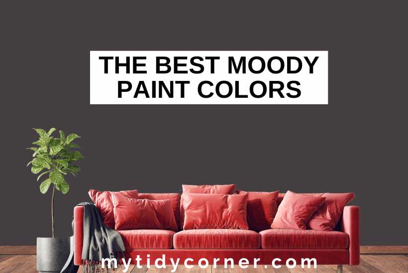
These are my top picks of the best moody paint colors for adding interest to your interiors.
Social media is awash with carefully curated beige, white, and cream interiors, with a touch of taupe for interest. But there’s another trend that keeps me scrolling — dramatic, character-filled rooms full of deep, moody colors.
Whether jewel colored or darkly brooding, these colors infuse any space with personality. Let’s explore the best moody paint colors available.
The best moody paint colors by Sherwin-Williams are Regatta, Iron Ore, and Darkroom. Behr’s fan favorites are Cracked Pepper, Rumors and Dark Everglade, while Benjamin Moore’s are Beau Green, Rocky Coast, and Middlebury Brown. Farrow & Ball’s most popular are Pelt, Stiffkey Blue, and Brinjal.
The Charm of Moody Colors
All colors create a vibe or mood but moody colors are magical. They imbue a space with mystery, coziness, drama, excitement, depth, or even utter serenity.
Some people are nervous of moody colors because they aren’t keen on maximalist looks. Of course, moody colors are stunning in eclectic, vintage and romantic interiors. But they are surprisingly versatile and contemporary. This is why you’ll find them among the most popular shades. Luxury paint brands like Benjamin Moore, Behr, Sherwin-Williams, and Farrow & Ball all produce them.
Top Sherwin-Williams Moody Colors
Darker paint colors are on trend this season. And Sherwin-Williams has produced some of the most atmospheric, and luxurious moody colors available.
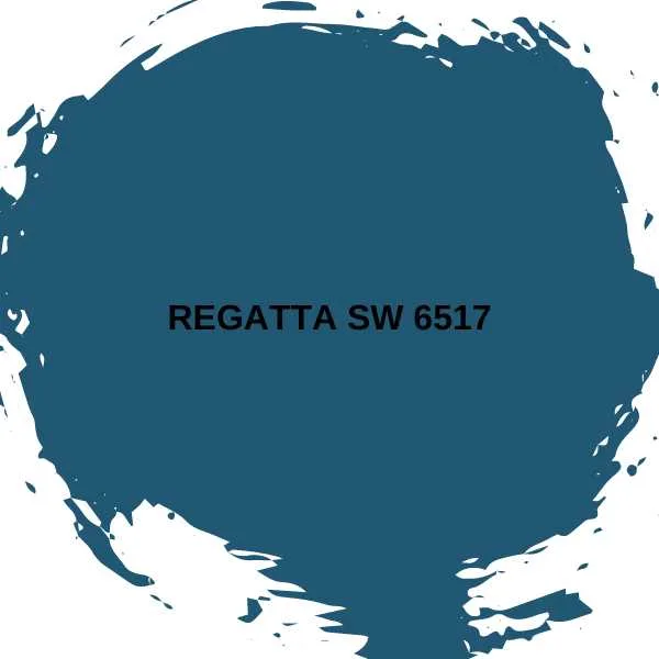
#1. (HGTV)
With its deep violet undertones, Regatta is the color of the deepest sea. This moody blue will create the most soothing of bedrooms. It’s also great for dreamy bathrooms, or sophisticated living rooms, adding a nostalgic touch. Combine Regatta with jewel tones. This will create a vintage atmosphere and add interest to a dimly lit north-facing room.

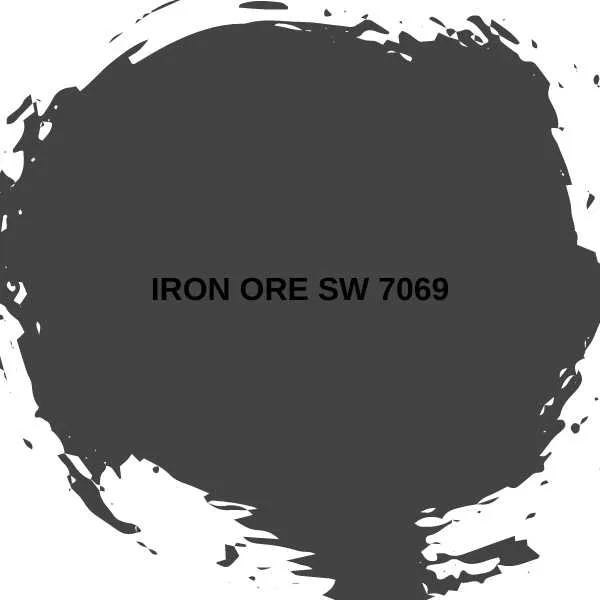
#2. Iron Ore SW 7069
Charcoal is a dramatic choice for wall paint. It is best used in south-facing rooms with lots of light and pops of colorful accents.
However, I’d like to make a case for this mysterious color. It can work in smaller rooms that aren’t necessarily filled with sunshine. Charcoal creates an expected air of mystery and drama when layered with grays and blacks, resulting in a sophisticated space.
Consider Iron Ore for industrial-inspired, minimalist, and ultra-modern interiors.

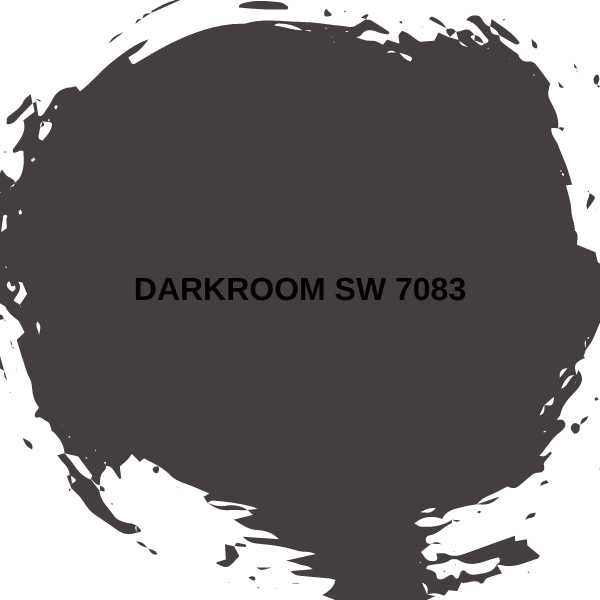
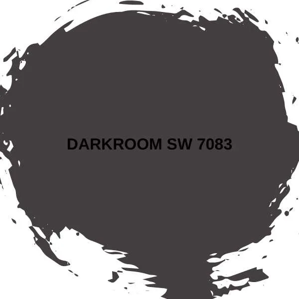
#3. Darkroom SW 7083 (HGTV)
This paint color is extraordinary. It glows brown, black, and purple, and is the most luxurious and luscious color on this list. Its unusual tone makes Darkroom a chameleon. This is why it’s perfect as an anchor in a neutral scheme filled with rich brown and natural textures.
It’s equally gorgeous in a sophisticated and regal bedroom, with purple accents. And I dream of it in an English country mudroom, filled with rainboots, freshly dug carrots, and a gamekeeper, dropping off a pheasant.
Best Moody Paints by Behr
Behr consistently produces gorgeously intense, durable colors that provide excellent cover.
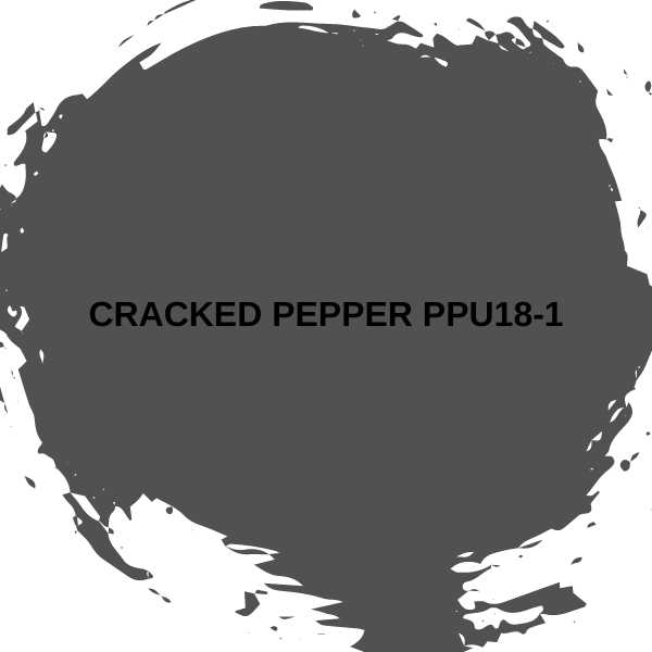
#4. Cracked Pepper PPU18-1
This soft charcoal-black is Behr’s Color of the Year for 2024, a strong statement about the joy of moody colors. Cracked Pepper has a warm undertone. It can be dramatic and cutting-edge in an industrial or minimalist kitchen.
It can also be cozy in a color-drenched living room. A space that will make you want to curl up on a velvet couch with a cup of tea and a good book. And imagine you’re out on the English moors, waiting for Heathcliff.

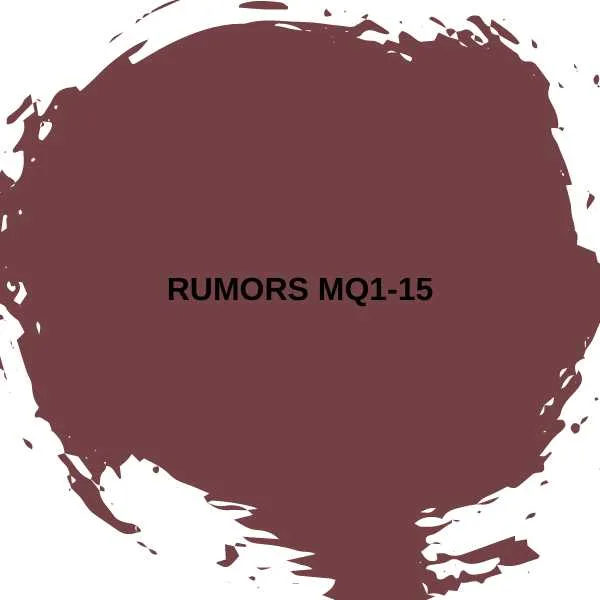
#5. Rumors MQ1-15
Burgundy, a lush purple with wine-red tones, is romantic and theatrical. Rumors is a color made for eclectic and maximalist interiors. It is most effective with a treasure-trove of jewel tones like teal, emerald green, and sapphire blue.
Create a dramatic bedroom filled with lush textures of velvet and glowing metallic accents.

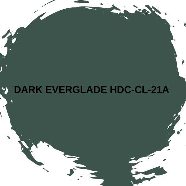
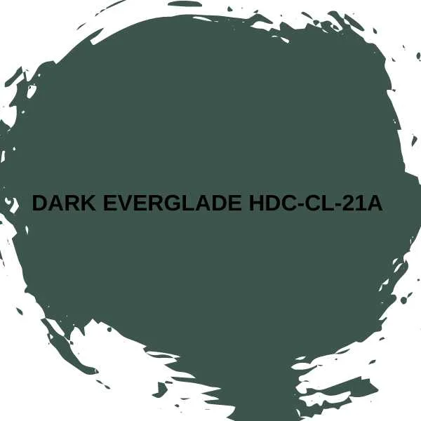
#6. Dark Everglade HDC-CL-21A
This deep, rich green is easier to live with than black and charcoal. So, it is a harmonious choice of moody color. Green is always symbolic of growth and peace. This makes it a wonderful color for living rooms and kitchens.
Moodier greens like Dark Everglade are deep and sophisticated. These are ideal for vintage home offices, libraries or studies with antiques and black and white photos. They’re also lovely colors for kitchen cabinets.
Benjamin Moore Moody Paint Colors
This paint brand is synonymous with luxury, high-end colors for interiors and exteriors. Here’s their top three moody colors.
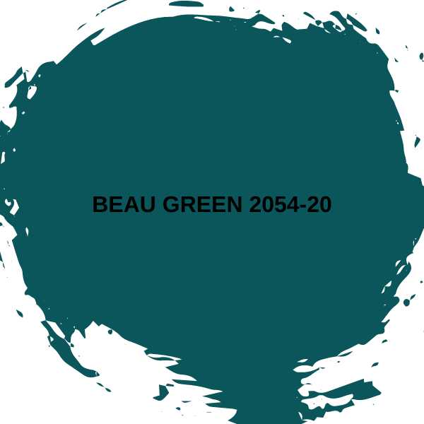
#7. Beau Green 2054-20
Teal, the greener cousin of peacock blue, is another color from the jewelry box. Beau Green is a deep teal with hints of sapphire and emerald that is perfect for traditional, retro, and vintage interiors. It looks lovely with dark woods and mid-century modern furniture.

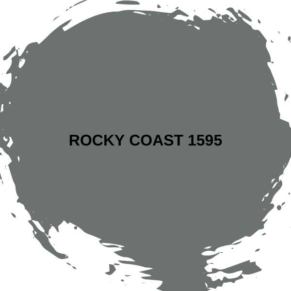
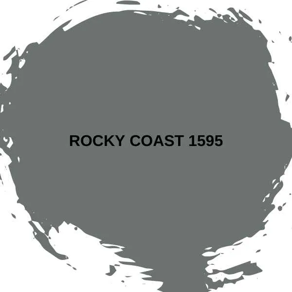
#8. Rocky Coast 1595
Darker shades of gray, including charcoal and pewter are moody and brooding, like stormy skies. Rocky Coast is the color of wave-tossed rocks and dark puddles. It adds depth and interest to minimalist interiors.
I also love gray as an anchor for the pop of bolder accents and light wood of Scandi-inspired interiors to shine. This charming shade is perfect in both home offices and serene bedrooms. It is also great for trim and cabinetry in a modern kitchen.
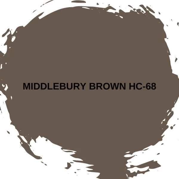
#9. Middlebury Brown HC-68
Chocolate brown is a lush, earthy shade that’s right on trend. It’s ideal for drenching a den-like bedroom, enveloping you in peace and relaxation.
Combine Middlebury Brown with spicy mustard and terracotta red. Keep the floors and ceiling light to prevent the palette from becoming overly heavy.

Best Moody Colors from Farrow & Ball
Farrow & Ball has created some of my favorite moody colors, which have glorious associations with the English countryside. As a romantic Gothic literature fan, I’m obsessed with these colors.
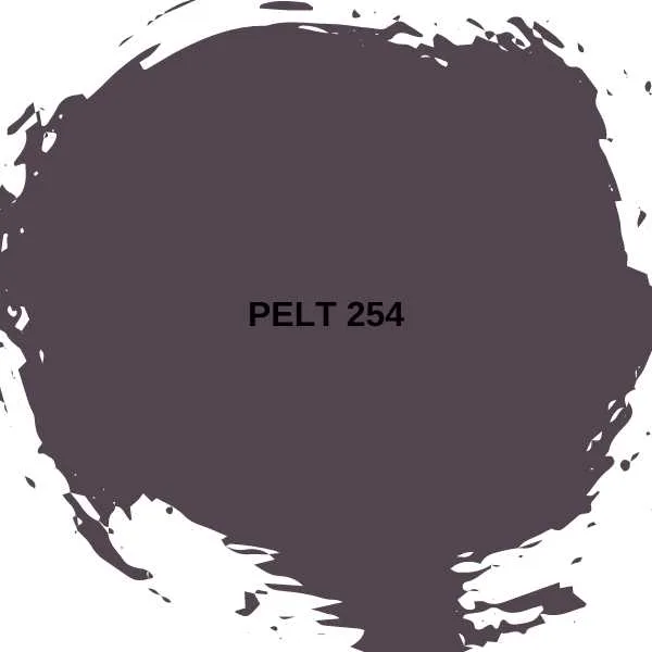
#10. Pelt 254
Conjuring up images of the softest animal fur, Pelt is a lush purple with deep blue and black undertones. Embrace a cozy atmosphere using Pelt in a smaller or light-starved space. The color will glow and purr like a black cat.
Or make the most of your natural light and enjoy the dramatic purple shade alongside mid-toned wood, vivid patterns, and a moody, vintage-inspired eclectic aesthetic.

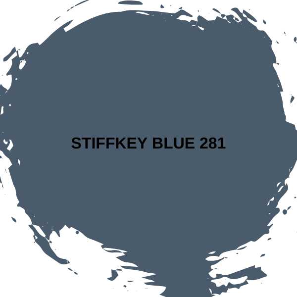
#11. Stiffkey Blue 281
Darker and dustier blues are atmospheric and moody. But they are also as comforting and tranquil as lighter shades. Stiffkey Blue has gorgeous gray undertones and pairs well with gray, cream, and white.
I love this color for kitchens (both walls and cabinets). It gives a retro, farmhouse touch without getting too rustic.

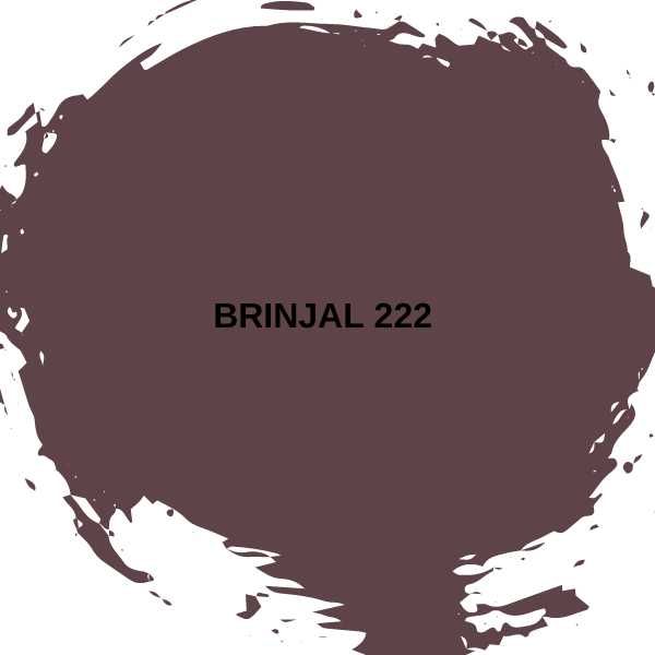
#12. Brinjal 222
Purple is a glamorous alternative to black and charcoal if you’re going deep and moody. It’s inviting on its own in an enticing, enveloping powder room, or as a complementary shade in a kitchen. Combine Brinjal with teal, crimson, or even chartreuse for maximalist sophistication.

Final Thoughts
Moody colors are a magnificent alternative or complement to trending neutral palettes. If you’re a fan of Bohemian, eclectic, vintage, retro, or dark academia aesthetics, look out for these shades.
Related Paint Color Resources:
- 13 Best Blue Green Paint Colors
- Top 13 Paint Colors for a Man Cave
- 16 Popular Blue Paint Colors
- Top 15 Brown Paint Tones
- 12 Popular Cream Paint Colors for Walls

