Transform your home with the best Sherwin Williams green paint colors. Explore our top picks and find the perfect green to suit your style and space.
I love the Japanese belief that forests are healing and that “bathing” in their dappled green light has health benefits.
The philosophy of shinrin-yoku teaches that reconnecting with nature is good for you, with design’s return to sustainability and eco-chic bearing this out.
An easy way to introduce more green into your environment is through paint, particularly the gorgeous hues developed by Sherwin-Williams.
The best light-toned Sherwin-Williams green paint colors are Sea Salt, Rainwashed, Clary Sage, Evergreen Fog, and Jardin. Oakmoss, Hazel, Greenfield, and Grandview are medium-toned, while Vogue Green, Secret Garden, and Pewter Green are dark, moody greens.


As I’ve probably mentioned, green is my favorite color, and I am delighted to see it coming back into interiors.
Many of us avoid using it in our homes because the sheer variety of shades makes matching tricky. But there is a shade for every room, especially if you’re looking to use Sherwin-Williams paints.
12 Best Green Paint Colors from Sherwin Williams
Color psychology emphasizes green’s refreshing, calming effects on our stressed bodies and minds.
Greens with blue undertones are cool and crisp, yellow-toned greens are lively and energizing, while this season’s gray-toned greens are earthy and muted. Here are my top recommendations.
#1. Sea Salt SW 6204


If you’re nervous about adding green to your home — but would love the courage — I urge you to try one of Sherwin-Williams’ best-sellers: Sea Salt.
This subtle, blue-toned green is cool, serene, and elegant, pale enough to function as a neutral.
Perfect for coastal aesthetics, this seafoam green is muted and soft, working well with white, gray, and blue in a bedroom. It’s also charming for a cottage-core kitchen, paired with dusty pinks.
#2. Rainwashed SW 6211


Part of Sherwin-Williams’ Recharge palette, this minty blue-green is the ultimate spa shade.
Light and airy, Rainwashed is ideal for relaxing bathrooms, where you can layer it with other neutrals to create a mermaid fantasy. (I never had a daughter, so I’m holding out for a niece to create a mosaic-inspired bathroom with shiny tail tiles.)
Rainwashed is also gorgeously tranquil for a bedroom, whether paired with a brass bed and quilt for vintage elegance or other misty shades in a minimalist dream.
#3. Clary Sage SW 6178


There are those who feel that sage has had its moment, being the kitchen color of choice for the past couple of years.
I’m not one of them: this yellow-toned green is so beautiful and lush that it could be used anywhere.
Consider Clary Sage for a coastal grandma bedroom, with billowing muslin curtains. Or create a retro kitchen with fifties-inspired light fixtures and crockery.
#4. Evergreen Fog SW 9130

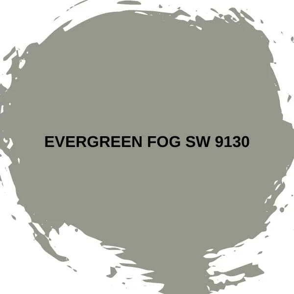
This muted green-green is one of Sherwin-Williams’ best-sellers, being 2022’s Color of the Year.
Evergreen Fog is like mist, shifting and changing color under different lights, but utterly perfect for trending earth-toned interiors.
Sherwin-Williams’ marketers call it a “chameleon color” as it can work as a neutral with natural wood, brown, beige, and taupe in an organic modern scheme. It can also add color to an elegant interior with warm brass accents.
#5. Jardin SW 6723


I can’t help but feel that this color was inspired by the vivid herbaceous green of spring leaves — Jardin is the perfect leafy green.
Reflecting light in sunny rooms, Jardin is bright and vibrant. Almost tropical, it adds zest to more formal rooms.
Jardin also works well paired with crisp white linens in an elegant bedroom.
#6. Oakmoss SW 6180


Another of the earthier tones in Sherwin-Williams’ range of greens, Oakmoss has yellow-gray undertones, making it more cheerful than Evergreen Fog.
I love the muddiness of this color, which gives it a luscious depth and makes it equally suitable for a child’s bedroom, a vacation cabin, and a sophisticated dining room.
Pair Oakmoss with warm neutrals, wooden furniture, and low lighting for a tranquil bedroom, or dark cabinets and white accents for a farmhouse kitchen. I also love adding orange for a seventy’s vibe.
#7. Hazel SW 6471


This paint color is a bit like my Lemon Surprise Dessert — the surprise is that it’s chocolate, not lemon.
Hazel isn’t hazel at all — it’s a whimsical, cheerful, and charming green-blue. It’s perfect for bathrooms and an excellent candidate for the color-drenching trend, making small rooms look more spacious and airy.
I’d also recommend Hazel for restful bedrooms, especially if you’re keen on a coastal feel.
#8. Greenfield SW 6439

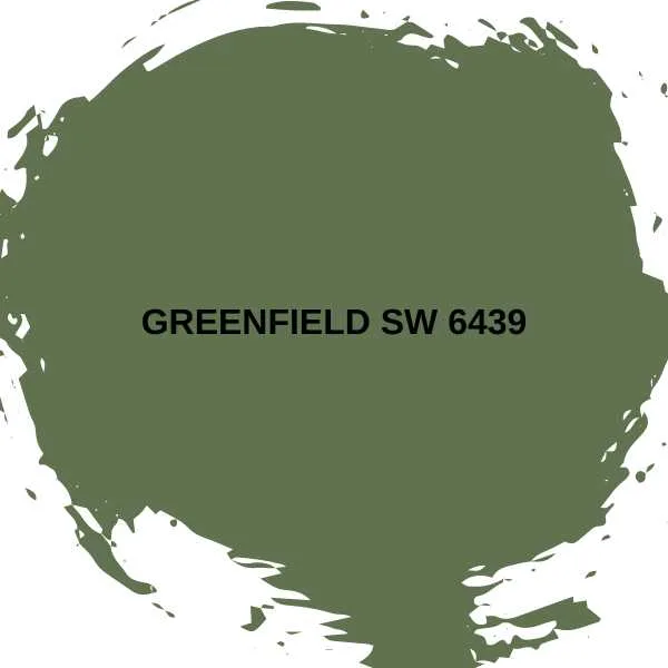
If you’re a fan of the timeless kitchen, I’ve got the cabinet color for you: Greenfield.
This intense green is the color of dill pickles, although strictly speaking, it’s a forest or heather green.
Greenfield is traditional enough for a classic kitchen, with cream accents and granite countertops. But I like it in a contemporary space, with concrete floors, chrome, and marble. Keep the walls white to soften the look.
#9. Grandview SW 6466


Grandview is a true seaside shade, intense blue-green, verging on turquoise or aqua.
A natural pairing would be coastal brights, such as coral and yellow, especially in a playroom or kid’s bedroom.
But Grandview also has a vintage feel, especially when you add a dose of lush cream in a charming, nostalgic kitchen or bathroom.
#10. Vogue Green SW 0065


Vogue Green is one of Sherwin-Williams’ historic colors, and it is a true hunter green.
This versatile and timeless color works with almost any interior style.
Choose Vogue Green if you love an English country aesthetic and want to create a gallery wall in your study.
It’s also gorgeous in a vintage farmhouse style, an organic modern style, or a cozy rustic style.
#11. Secret Garden SW 6181


Darker greens are grounding and full of depth. This gorgeous forest green is another classic green you can use with most aesthetics.
It can be glamorous in a traditional dining room (just be careful of combining it with nineties burgundy) but also on-trend in an edgy, industrial space with open brickwork and dark metals.
The yellowish undertone adds warmth.
#12. Pewter Green SW 6208

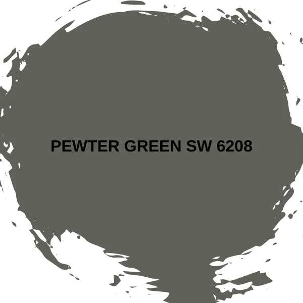
The deepest, darkest green, Pewter Green has a charcoal undertone that makes it the moodiest, most sophisticated of Sherwin-Williams’ greens.
It belongs to the hunter-green family, so it has an English country house vibe, if you like a traditional or even colonial look. However, I’d suggest pairing this with warm wood and chrome to keep it up-to-date.
Final Thoughts
Sherwin-Williams is known for its high-quality range of paints, and the selection of greens does not disappoint. From the palest seafoam to the moodiest pewter, there is a shade of green for every aesthetic and every style.
Related Paint Color Articles:
- Top 17 Sherwin Williams Coastal Paint Colors
- Top 10 Sherwin Williams Blue Gray Paint Colors
- 11 Best Sherwin Williams Gray Paint Colors
- 14 Best Sherwin Williams Neutral Paint Colors
- Top 12 Blue Paint Colors from Sherwin Williams
- 11 Best Benjamin Moore Green Paint Colors
- 12 Popular Sage Green Paint Colors

