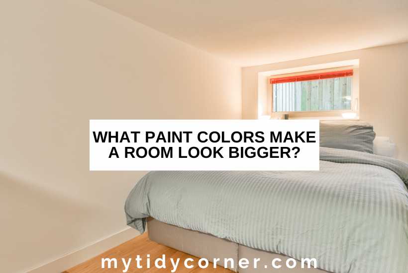
I’ve had some of my readers ask, “What paint colors make a room look bigger?” So today, I’m writing a post on this topic to answer their question.
The trend towards smaller homes, including those categorized as tiny, means that rooms are getting smaller. I’m delighted with my modest-sized home but don’t want to give the impression of cramped, poky spaces.
A well-planned interior design and color palette can help create the illusion of space. Let’s explore which paint colors can make a room look bigger.
Paint colors make a room look bigger by reflecting light to give the illusion of space. Choose light neutrals, including white, ivory, cream, beige, greige, and gray. Brighter colors can also reflect light and energize a small room, especially green, lavender, pink, yellow, and blue.
Choosing a color palette that visually extends the walls and ceiling is easy, so long as you follow a few of my tried and tested tips.
Enjoying an airy, bright space is a matter of choosing the right color to enhance the light a room gets. Here are my top recommendations for paint colors that make rooms look bigger.

Related Articles:
- Simple Ways to Make a Small Room Look Bigger
- Best Ceiling and Wall Color Combinations
- 12 Best Paint Colors for North Facing Rooms
Choosing the Best Color Paint that Makes a Room Look Bigger
We all know that a lick of paint won’t literally enlarge a room. However, selecting the right paint color can transform a chilly, dark room into a comfortable, pleasant one.
To choose the right paint color, work through these questions.
How Much Light Does the Room Get?
Your first consideration is how much natural light a room gets. Paint makes a room look bigger by reflecting light, creating a bright, inviting space.
The sunlight will bounce off the walls in a room with plenty of windows that gets full sun, even if you use an intense color. This type of room gives you the most color options.
Some small rooms have plenty of windows but may be south facing or shaded, so they are naturally lit but remain cold. You’ll need to choose a warm color to create the illusion of brightness, size, and space.
Small rooms without natural light (e.g., a hallway, basement, or under the stairs) will be dark and uninviting. You can brighten them with artificial lights, accent lights, mirrors, and paint.
However, cool colors can look flat under artificial light, so you’ll have to go for a warm color or one with a warm undertone (like red or yellow).
Before painting, check the color in the room under natural and artificial light.
What Mood Do You Want to Create?
Paint color choice will also depend on the vibe you want to create in the room and the interior style you want to achieve. For example:
- Is the room a functional space that the whole family will use, like a bathroom?
- Are you designing the room around antique furniture you inherited and want a vintage feel?
- Do you have a little snug that you want to transform into a cozy reading and listening room full of squishy pillows and fluffy blankets?
- Are you longing for a glamorous, luxurious space to indulge in your love of gold accents and dramatic window treatments?
9 Best Colors to Paint a Room to Make It Look Bigger
Once you’ve identified the room’s light options and interior style, you can choose a paint color to make the room look bigger. Designers recommend these colors to enhance light and space in any room.
Neutrals
Light colors are the best choice for making a room appear more spacious because they have a higher LRV (light reflectivity value). A color with 100 LRV will reflect all light, while one with 0 LRV will absorb the light. Choose eggshell or gloss paint, as matte paint doesn’t reflect light, whatever the color.
#1. White

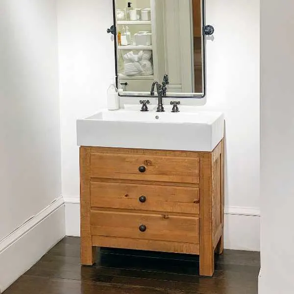
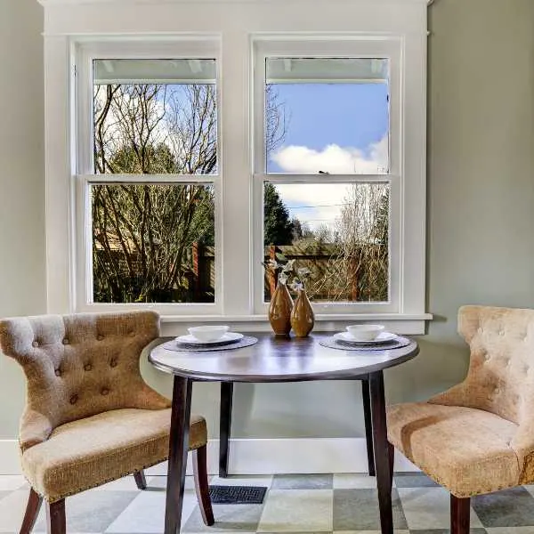
The safest option for small rooms is fresh, clean white, as it immediately creates the illusion of space and light. It’s ideal for functional areas like kitchens, bathrooms, and laundry rooms but will transform any small space.
If your room is full of natural light, you can choose a crisp, pure white that will sparkle. Here are some gorgeous white paint colors:
- Polar Bear by Behr
- Fresh Kicks by Clare
- All White by Farrow & Ball
- Extra White by Sherwin-Williams
#2. Off-White
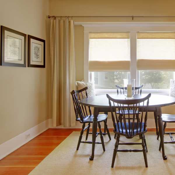

If the room you’re decorating will be lit by artificial light, go for a warm-toned off-white to avoid a cold, sterile space. The latest interior trends are towards warmer neutrals, so embrace ivory, cream, and beige. You’ll still maximize the natural light but with a hint of warmth and depth.
Off-white is an excellent choice as an anchor for a neutral color palette, where you add chocolate brown and dusty tan for accents or layer up earthy shades for eco-chic.
These are gorgeous, warm-toned off-white colors:
- White Dove by Benjamin Moore
- Chantilly Lace by Benjamin Moore
- Marshmallow by Sherwin-Williams
- Nuance by Sherwin-Williams
#3. Greige
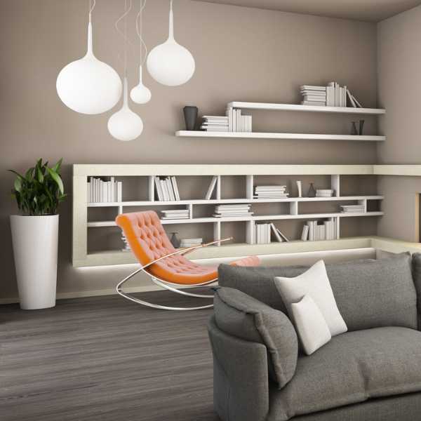

I’m a massive fan of this beige-gray combination, with its lush putt-like tone that adds depth and light. Greige ranges from a light-toned cool gray-forward color to a medium-toned reddish brown reminiscent of terracotta, so you’ll find a shade that suits your home.
When repainting with greige, take care to match the ceiling. Painting the ceiling in a contrasting color can make the room look even smaller, emphasizing the limited scale.
Color drenching means painting the entire room, ceiling, walls, door frames, and skirtings, in the same color or closely related shades. This creates the illusion of space by softening any architectural detailing and incorporating all elements, which tricks the eye with cohesion.
Greige is the perfect choice for Shaker and coastal-inspired styles and goes well with natural textures like wood, grass, and stone.
Here are my favorite greiges:
- Chelsea Gray by Benjamin Moore
- Neutral Territory by Clare
- Rustic Greige by Dutch Boy
- Barcelona Beige by Sherwin-Williams
#4. Gray

Another go-to alternative to white is gray, so long as you stick to a shade with a warm undertone. Continuing in popularity throughout our homes, gray remains a solid choice for smaller rooms, looking serene and anchoring any color palette or style.
As with greige, don’t create too much contrast with trim, ceiling, and floor colors: the larger the contrast, the smaller the room appears. Match light walls to light floors.
There are many shades of this versatile color, but these are truly gorgeous:
- Irish Mist by Behr
- Gray Owl by Benjamin Moore
- Smooth Stone by Glidden
- Villa Gray by Valspar
Brights and Lights
If neutrals are too dull or impractical for you (think grubby toddler hands on an off-white sofa), bright and light shades can also create the illusion of space, even in light-starved rooms.
Pale and pastel shades will reflect light and are ideal replacements for white or other neutrals. However, don’t discount the effect of intense color: bold shades are energizing, instantly enlarging the room. Choose colors with high LRV so they absorb shadow rather than light.
Also, remember that too much contrast in trim and ceiling will overwhelm any space you’ve created.
#5. Green
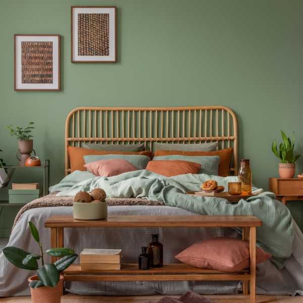
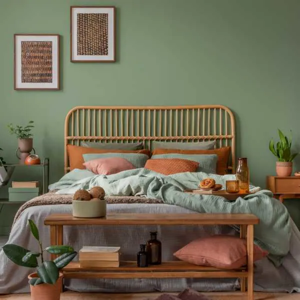
You’ve likely noticed green accents popping up in stylish interiors. All shades of this lush, natural color are in fashion and will enliven your living space.
You can use green to enlarge a space in three ways:
- Use gorgeous grassy, leafy shades in the small room if your window overlooks a garden or park. These colors trick the eye by blurring the distinction between outside and inside, making the room an extension of the outdoors. Play up to this theme by adding live plants, horticultural artworks, and floral fabrics.
- Pale shades of green reflect light to give the illusion of airy brightness. Sage is particularly popular right now for bedrooms.
- Brighter greens, including teal, energize a room. Consider adding it as a brightening accent if you find green overwhelming as a wall color.
These are beautiful green paints for your home:
- Winchester Sage by Benjamin Moore
- Dirty Martini by Clare
- Arsenic by Farrow & Ball
- Pewter Green by Sherwin-Williams
#6. Lavender
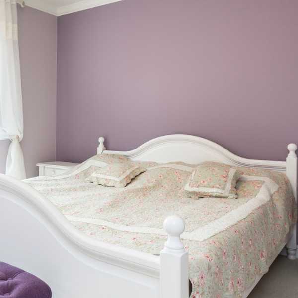
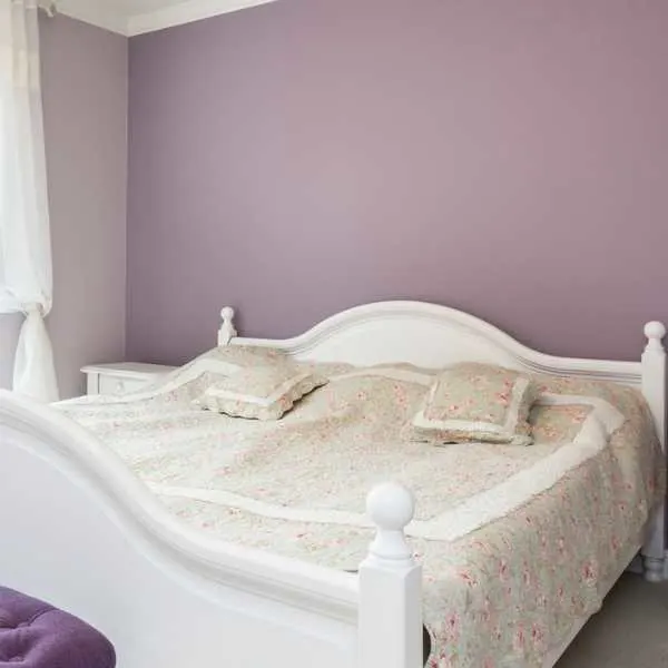
Delicate shades of purple like lavender and lilac have gently returned to our homes. Like lighter greens, these exquisite colors reflect light and brighten a room, particularly if you drench the room in purple.
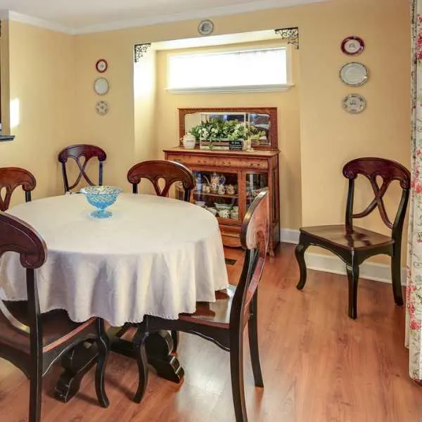
Choose lavender as a grown-up alternative to pink: it’s equally romantic and feminine but more elegant and sophisticated. It’s perfect in a baby’s nursery but can also step up in a formal dining room.
Try one of these purples:
- Tranquil Sea by Dunn-Edwards
- Peignoir by Farrow & Ball
- Purple 06 by Lick
- Plum Dandy by Sherwin-Williams
#7. Pink
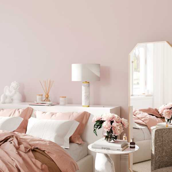
While we’re all caught up in delightful candy pink Barbie mania, lighter shades of pink are preferable for smaller rooms. Antique rose, blush, and dusty pinks function as effectively as light neutrals in opening up a space. Under natural and artificial light, they infuse the room with a warm glow.
Don’t limit pink to kiddie bedrooms or the powder room. A timeless blush pink is perfect for a retro or country-style kitchen. A dusty salmon goes beautifully in rustic, earthy interiors.
Try one of these lush pink paint colors:
- Meet Cute by Clare
- Pirouette by Divine Color
- Setting Plaster by Farrow & Ball
- Pink Slip by Little Greene
(Here are the best pink paint colors for bedrooms.)
#8. Yellow
There’s no happier color than yellow: the positive psychological effects of painting a room yellow are so uplifting that the room will appear bigger and brighter than it is.
Choose from pale, buttery yellow if you prefer neutrals, especially in a bedroom. Embrace sunny buttercup for inviting spaces where friends and family meet, like kitchens and comfortable living rooms.
Yellow’s natural warmth makes it an option even for the tiniest, darkest room, as it looks great under artificial light. It’s also versatile enough to go with most design aesthetics, from modern Scandinavian to classical Americana.
Here are just a few of the sunniest yellows available:
- Golden Hour by Clare
- Wild Wonder by Dulux
- Dorset Cream by Farrow & Ball
- Pale Hound by Farrow & Ball
#9. Blue

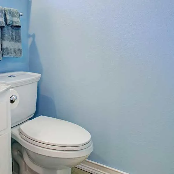
If yellow is the happiest color, blue is the most serene. Enfolding a room in pale blue creates a calm mood, which is why it’s most used in bedrooms and nurseries. However, pale and sky blue also reflects light and gives the impression of an open sky, making us think the room is much airier than it is.
You can take blue out of the bedroom. It’s perfect for spa-like bathrooms and forms a tranquil backdrop for living and dining rooms, where it works beautifully with pale wood.
Choose from a barely-there blue or a delightful robin’s egg shade:
- Gray Cashmere by Benjamin Moore
- Green Blue by Farrow & Ball
- Watery by Sherwin-Williams
- Bare Minimum by Valspar
Final Thoughts
The best paint colors that make a room look bigger have a high light reflective value (LRV), giving the illusion of space.
Light neutrals, including white, ivory, cream, beige, greige, and gray, are great for earth-toned, natural, and coastal interiors. Brighter colors can drench a room to blur the lines between architectural features and the indoors and outdoors. Choose shades of green, lavender, pink, yellow, and blue to enhance the space.

