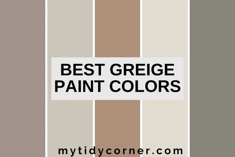
I’ve whittled down the list of the best greige paint colors, to help make it easier for you to choose wisely.
Lovers of the neutral palette have a new favorite: greige. This gorgeous shade that sits somewhere between gray and beige is part of the trend toward earthier colors.
If you’re new to greige, you’re probably wondering how to use this color and what the best greige paints are.
The best greige paint colors are muted, earthy shades with a good balance of grey and beige. Lighter greige tones are ideal as a substitute for white in a neutral palette, bringing much-needed warmth. Darker greige colors add richness and complement a colorful or monochrome scheme.
Decorating with greige is a pleasure because it’s a versatile, practical, and harmonious color. You can use it indoors and out, in any room in the house, and it flows smoothly into most interior styles.
Let’s look at this unusual color, how to use it, and which greige paints to choose.

Related Articles:
- Top Paint Color Trends
- 30 Best Neutral Pant Colors to Brighten a Room
- 13 Best Farmhouse Paint Colors
- 10 Most Relaxing Bedroom Colors
- 11 Best Paint Colors for Basement Ceilings
What Color is Greige, Anyway?
Interior design has had a long, long affair with gray and an even longer one with white. With the trend to warmer, earthier shades, these neutrals are being ousted by greige.
It combines gray and beige and enjoys the best of both colors. It has the elegance and sophistication of gray with the warmth and neutrality of beige.
You may be surprised to learn (I was!) that greige has been around since the 1980s and was first used to refer to Armani’s use of the neutral in his fashion lines.
Why Should I Use Greige?
Greige is the newest, on-trend neutral, for good reasons:
- Greige is chic yet inviting and is at home in farmhouses, loft apartments, penthouses, and townhouses.
- It’s appropriate in any room in the home, from elegant bathrooms to practical home offices.
- Whether you love Hollywood glam or Scandi minimalism, greige fits into any interior design style.
- It’s the ultimate neutral, straddling warm and cool color schemes, drawing together disparate shades, and embracing the bold and the subtle.
- Use greige to revive dated nineties and noughties interiors.
- Real estate experts report that greige helps a home to sell more quickly.

How to Choose the Best Greige
Choosing the best shade to fit your home can initially seem challenging, as you’re stuck between a cool grey color scheme and a warm beige one. Rest assured, greige can do both.
Like any color, greige isn’t a one-size-fits-all hue. There are several shades of greige, ranging from a pale beige with grey undertones to a medium warm beige grey, and finally, a deep grey shade with beige undertones.
Lighter greige is most popular, especially for walls, because of its versatility. Depending on what you add to light greige, you can go for subtle and sophisticated, minimalist and contemporary, or friendy and cozy.
Darker greige fits well with a contemporary earthy palette. If it’s too robust to paint a whole wall, try painting cabinetry or shelving to add interest to your kitchen, bathroom, or laundry.
However, you should consider the room’s purpose, how much sun it gets, and the planned design or color scheme to help you choose a light, medium, or dark greige.
Read on for my recommendations of the best greige paint colors available.
What are the Best Greige Paint Colors?
There is a greige paint color for every purpose. I’ve whittled down the list, so you don’t have to do the heavy lifting.
#1. Rustic Greige by Dutch Boy 404-4DB – Best Overall

This lush, earthy greige is this brand’s color of the year for 2023. A warm, gray-beige blend with red undertones, Rustic Greige is cozy, inviting, and friendly.
I love it for rooms where family and friends congregate, like busy farmhouse kitchens, celebratory dining rooms, and relaxed living rooms. This is the color of well-being.
#2. Agreeable Gray by Sherwin Williams SW 7029 – Best for Traditionalists

For those traditionalists who are undecided about the merits of the new neutral, this gentle shade is your gateway greige. It leans to the beige side but has enough of a gray undertone to keep it warm.
Try it with your favorite cream and off-white in a vintage-style kitchen with antique brass. Or paint a couple of walls in the dining room, keeping it classy with your taupe linen chairs but making it a little more contemporary.
#3. Intellectual Gray by Sherwin Williams SW 7045 – Best for Exteriors

This medium shade of greige has a lot of gray in it, but because it will be lit up by natural light, you will notice the warmth. It is beautiful for the house’s exterior or any outdoor space because of its earthiness. You can pair this greige with glossily painted wrought iron, crisp white trim, and bright greenery.
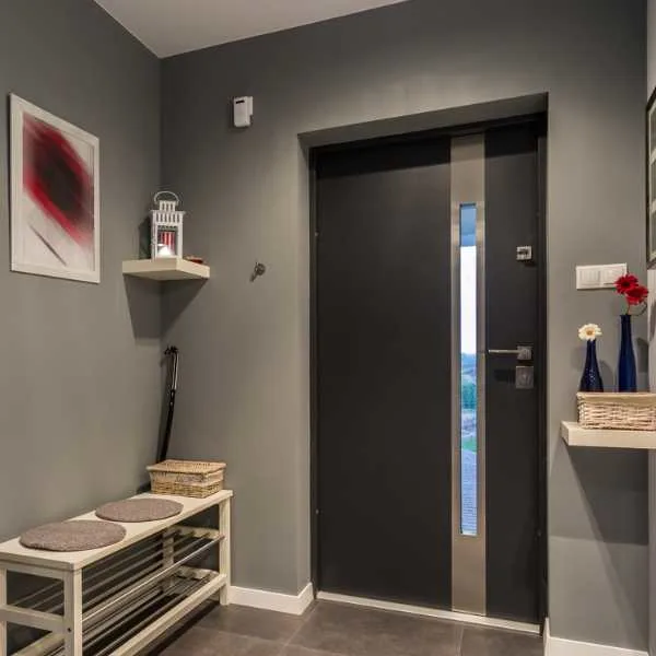
#4. Mega Greige by Sherwin Williams SW 7031 – Best for Entrance Halls

Choose a strong greige like the Mega Greige with yellow undertones for a small but welcoming space. The room will be warm and inviting, especially if you add other neutrals, like pale wooden furniture and rich tiled floors. It is also the perfect backdrop for colorful artwork.
#5. Revere Pewter by Benjamin Moore HC-172 – Best for Kitchens

Until Rustic Greige came out, Revere Pewter was my favorite, and I’d still recommend it to everyone.
This shade is one of Benjamin Moore’s best-sellers, the dreamiest, palest of greiges. It looks fresh and clean on the kitchen walls and upgrades plain wooden cupboards to elegant cabinets.
The muted yellow undertone adds coziness, which you don’t get from a plain gray. This makes it perfect for contemporary farmhouse-style kitchens, especially when combined with blue and white. Rustic accents like exposed beams are ideal with greige.
Go for Revere Pewter for other living areas that don’t get much light, as it infuses them with warmth.
A barely-there hue, it also looks beautiful in a kitchen with Scandi influences. Depending on the light, greige can have gentle pink undertones that work well in rooms with lots of natural light.
#6. Accessible Beige by Sherwin Williams SW 7036 – Best for Dining Rooms

Accessible Beige is one of Sherwin Williams’ top-selling neutrals by professionals and regular homeowners.
If you were a fan of beige in the 1990s, this is the ideal update greige. Instead of the yellowish undertone of beige, this elegant greige is subtly gray. It’s perfect for dining rooms as a neutral backdrop to the business of eating.
However, being neutral doesn’t mean this greige is boring. Its warmth makes it the ideal partner for Scandi style, with white furniture and natural textures.
An alternative is Tranquility by Benjamin Moore, a greige with a bluer tone that works well with gray and blue schemes. However, because of the beige undertone, you can add pink without clashing.
#7. Gray Mist by Benjamin Moore OC-30 – Best for Living Rooms

Fans of neutrals and clean, airy spaces can also enjoy greige. Gray Mist is the gentlest of greiges, softening a stark, modern color scheme without overwhelming it with color.
It even works with Bohemian interiors with ethnic textiles, wooden furniture, and indoor plants. A greige backdrop pulls together the warm tones, making it look contemporary rather than mismatched. It balances the different patterns and gives the eye a place to rest.
Another exquisite greige is Silver Drop by Behr, a gentle, dreamy color. It’s a great anchor for cooler palettes, creating airiness without the starkness of plain white.
#8. Redend Point by Sherwin Williams SW 9081 – Best for Bedrooms

Sherwin Williams’ color of the year for 2023, Redend Point, is a glorious greige with subtle blush undertones. It’s so deliciously warm and earthy that any bedroom will become a cozy haven immediately. Ground your bedroom with these luscious neutral walls, and you won’t have to add any other color.
#9. Sculptor Clay by Behr PPU5-8 – Best for Nursery

Sculptor clay makes a perfect backdrop for a baby or child’s room as a neutral against which you can add pops of color.
Even if you combine contrasting colors like blue and yellow or monochromes like black and white, this greige balances and pulls them together. It prevents the room from looking too busy while still being whimsical.
#10. Drop Cloth by Farrow and Ball No. 283 – Best for Bathrooms

Look, I don’t think I’ll convince the white-bathroom brigade to use greige, but can I tempt any lovers of beige out there? This gorgeous greige is bold and saturated.
It’s not as gray as charcoal but warmer and richer than taupe. Combine it with a white ceiling, enormous mirrors, and plain white fittings for a sleek, contemporary look that reflects the earthy trend without giving up its sophistication.
#11. Chelsea Gray by Benjamin Moore HC-168 – Best for Powder Rooms

Because of their size, powder rooms are ideal for experimenting with new colors. Try a dramatic dark greige like Chelsea gray and a black and white color scheme to add interest.
#12. Amazing Gray by Sherwin Williams SW 7044 – Best for Home Office

Greige is one of the best colors for WFH spaces, as gray is known to be a color that helps with focus and concentration, while beige is calming and destressing.
Amazing gray has a solid gray element, so layer it with gray and white neutrals for a professional, balanced space. This beautiful color is one of the brighter greige hues, so it’s also great for spaces without much natural light – like a home office squeezed into a nook.
#13. Cromwell Gray by Benjamin Moore HC-103 – Best for Laundry Rooms

A functional room doesn’t have to be boring. Instead of painting your laundry room an uninspired white, add some neutral color with a dark greige like Cromwell Gray. This shade has a slightly green undertone that makes it interesting.
Final Thoughts
Greige is the perfect neutral to replace dated beige, dull gray, or boring white interiors. Choose a lighter greige for airiness as part of a cool palette, or go for a putty-like greige to complement warmer color schemes.

