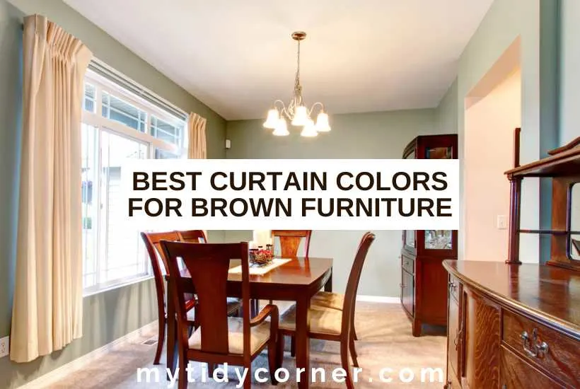
Looking to find the right color of curtain to complement your brown furniture? Let’s look at the best curtain colors for brown furniture.
Brown is leading the color pack for home decor updates this year. Perhaps you’ve just invested in a chocolate sofa or handcrafted wooden furniture to add earthy warmth to your room.
Or maybe you’ve still got treasured brown pieces from the 70s (when the color’s popularity also skyrocketed).
The best curtain colors for brown furniture are other on-trend earthy hues like muted greens and oranges. A warm, light neutral like soft cream brightens gloomy dark-brown spaces. Vivid jewel colors like sapphire, ruby, and emerald stick to the natural theme while adding a punch of personality.

What Color Curtains Go Well With Brown Furniture?
No other color captures the earth’s grounding essence quite like brown. This color looks most at home when surrounded by other nature-inspired hues, whether neutral or vivid.
The right curtain color will maximize brown’s restorative quality to create an instantly cozy and calming space. Let’s see what curtain colors flatter different room designs with brown furniture at center stage.
Earthy Colors: Greens, Oranges, and Creams
Those in the know say brown is booming in interior design. Think all artisan wooden furniture in its natural state, wood-paneled walls, and richly textured, espresso-hued linen sofas. You’d be excused for thinking you’d flashed back a few decades!
Oranges are also experiencing a comeback for pairing with these dark shades, as are other colors from nature, like greens and creams.
These organic tones are fashionable again because our homes reflect our eagerness to be at one with the outside world and embrace eco-friendly living (a wave of environmental awareness also washed over the 70s.)
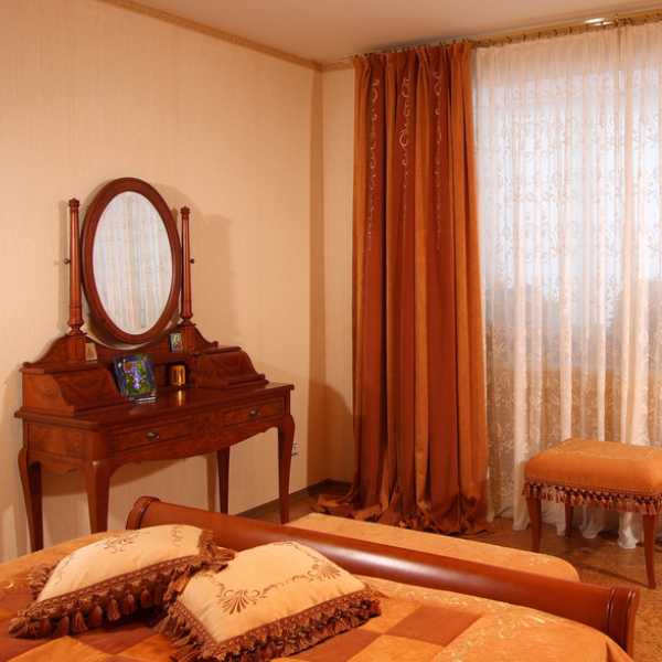
Coordinating your chocolate-, coffee, and nut-hued furniture with curtains in warm cream, burnt orange, or soft green will show your love for nature. You’ll also create a snuggly space to bring out your inner homebody.
Look outdoors for inspiration for matching shades. Rust, terracotta, olive green, gentle sage, and muted moss create an inviting, soothing atmosphere.
Consider off-white to lighten designs featuring lots of deep brown—especially if it’s splashed on the walls. You’ll get a brighter look and contrast while keeping the mood serene.
Also, choose this latte-inspired combo if you want a foolproof color scheme with staying power. These timeless neutrals look like they were made for each other.
Bold Contrast: Vivid Colors and When to Use them


Muted colors create a relaxing sanctuary vibe, but you may want something livelier with tons of character. In this case, let your personality guide you to vibrant hues that energize brown furniture.
You can go bold while sticking to a natural theme by choosing rich jewel shades for your curtains. There’s something incredibly luxurious about sapphire, ruby, emerald, or amethyst tones against sumptuous brown.
Moody shades like midnight blue, deep forest green, and ocean green-blue also create a dramatic effect.
The many benefits of using vivid curtain colors for brown furniture (beyond giving you a thrill whenever you see them) include adding depth and pizazz to rooms. They also become a focal point (which is brilliant when you want to draw attention to a spectacular view from your windows).
Worried that these intense tones will overpower your space? Don’t be. Your furniture will mellow them out. Using a neutral foundation to balance daring accents is a hack I keep on repeat.
Also, know that light natural woods work wonders to lift powerful shades. Alternatively, you could skip the solid color and slip in just a pop of something adventurous in a curtain pattern, print, or trim.
The Effect of Light: Choosing the Right Curtain Opacity
Many years ago, I decided to get custom-made curtains to fit an awkwardly sized window. I found a fabric in a gorgeous color that coordinated with the rest of my room’s decor and handed it to the seamstress. After hanging them early one morning, I admired how beautifully the hue enhanced the space.
The color was far less flattering as sunshine flooded the room in the afternoon. While looking for the right fabric, I’d held swatches against my furniture and accessories but not near the window at different times of the day. Now, I never skip this step.
Natural and artificial light can wash out certain fabrics or even bring out unexpected undertones. So, check how potential matches act in different lighting conditions before making the final choice.
It’s best to test the actual fabric, but here are a few pointers to help you understand how different opacities respond to illumination:
Transparent
Floaty materials like chiffon, lace, delicate muslin, and gauze are spot-on for an easy-breezy mood. They let maximum light shine through and are the most likely to appear a different color when illuminated.
Translucent
Thin cottons and linens are semi-transparent and perfect for elegant and casual vibes. They allow a moderate degree of light to pass through with a slight color change.
Opaque
Thick materials like velvet, taffeta, suede, and tweed hang well and give rooms a formal or cozy feeling. They block light and are the least likely to experience a change of color in sunshiny conditions.
Of course, opacity affects not only your curtain’s color. It also influences how much outside light flows into a space. A sheer window treatment will brighten a living room with dark brown furniture. In contrast, a blockout style is more appropriate for a bedroom.
Accessorizing: Coordinating with Rugs, Cushions, and Throws
Repetition creates a sense of unity and harmony in interior design. So, whatever curtain color you settle on, make sure you also use it in other accessories for a put-together look.
A popular technique to help even beginners balance color schemes is the 60-30-10 rule. Select a main color for 60% of your room (your walls and large furniture, for example).
Use a secondary color for 30% (this is where your curtains and perhaps an accent wall, chair, or rug come in.) Then, sprinkle a third color over the leftover 10% (cushions, throws, lamps, or other decorative objects).
Let’s use a biophilic palette to bring this rule to life. You could use various brown tones as your dominant hue, shades of green as your main accent, and a range of creams as your other accent.
Final Thoughts
I’m delighted brown is back on the decorating scene. With this versatile color as your furniture foundation, you can go comforting or glam with your curtains with equally attractive results. The safety of brown allows you to experiment with colors to get a personalized palette. Start your exploration with ones naturally occurring in our surroundings, such as earthy or jewel tones.
More Curtain Colors Resource:
- What Color Curtains Go With Blue Couch?
- Tips for Choosing Curtain Colors for Wooden Floors
- Best Vastu Approved Curtain Colors

