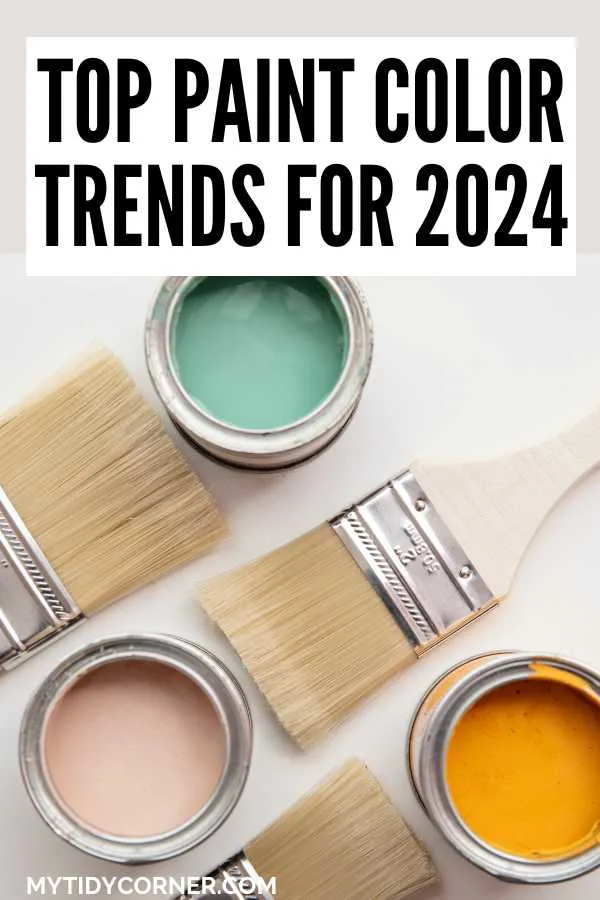
Discover the top 2024 paint color trends from the major paint companies. Here’s a look at the trending shades that will be popular for interior home decorating this year.
Trends in home decor tend to reflect the zeitgeist in which we live. Right now, our homes have become sanctuaries where we can find peace, restoration, and contentment in a world of change and turmoil. Let’s examine how the latest color trends reflect our desire for coziness and joy.
The latest paint color trends are optimistic, bright, and vibrant. Trending colors reflect the natural world: earthy browns, sea blues, moss greens, peacock teals, terracotta pinks, and citrus yellows. Warm neutrals like greige, charcoal, and cream continue to be popular instead of white and grey.
Following color trends reveals much about how we live and want to live. Post-pandemic, we surrounded ourselves with light as white, grey, and neutral colors mirrored our need for calm and security. A few years on, trends are changing as we embrace life in all its myriad hues.

What are the Top Paint Color Trends for 2024?
The broadest trends in paint color are away from cautious albeit soothing pastel shades and towards intense, natural colors. Colors reflect a mood of optimism and joy with which we want to fill our homes.
Color and Wellness
The wellness trend we have enjoyed in all other aspects of our lives – exercise, meditation, clean eating, athleisure fashion – is now emerging in home decor. The qualities of strength, positivity, and joy are soon to infuse the colors that surround us.
The psychology of color, always a consideration in interior design, is now being foregrounded by paint producers, including Valspar. Color is vital in making your house feel like a home, a comfortable, welcoming space that soothes and relaxes.
Valspar has chosen not one but 12 colors as their headline for the year. Each color relates to a mood that I certainly want in my home.
For example, there’s Green Trellis, a natural, organic color to induce calm, and Southern Road, a rich blue associated with contentment, slowing down, and enjoying life. Cozy White is an off-white color intended to bring comfort, warmth, and familiarity to your surroundings.
Similarly, PPG paints has a color palette named Serenity. At the same time, Behr invites you to “find your center” and Dunn-Edwards to “live in joy” when exploring their newest shades.
These are my favorite new uplifting shades:
- Flora by Valspar
- Peaceful Blue by Behr
- Get up and go! by Dunn-Edwards
- Visionary by PPG
Eco-Chic and Organic Colors
Calling the trend eco-chic somehow undermines how vital bringing the natural world into our homes is. Nature-inspired colors root us in our environment, whether the deep greens and browns of mountains, the deep rust, and gold of the desert, or the pink and grey of rich clay.
Many of the colors chosen as paint manufacturers’ and trend forecasters’ color of the year for 2024 reflect this warm earthiness that is so appealing.
Green
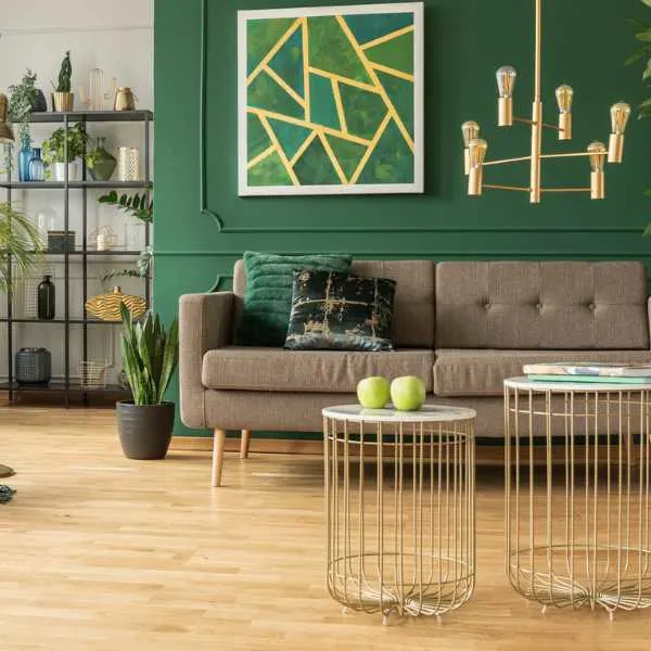
With this trend beginning in 2022, green is now a firm trend in home decor. While hints of green were brought in through plants and accessories, green is now a popular paint color for interiors, regarded almost as neutral: after all, green goes with every color in the natural world.
Green is also highlighted by the wellness trend, as the color brings calm and serenity to any interior. Choose a peaceful olive, a dark moss, or a gentle sage green to promise restoration and renewal.
Krylon’s color of the year is Spanish Moss, a deep forest green ideal for cabinets and shelving.
Other beautiful green paint colors are:
- Nature’s Gift by Behr
- High Park by Benjamin Moore
- Pewter Green by Sherwin-Williams
- French Market by Olympic
Blue
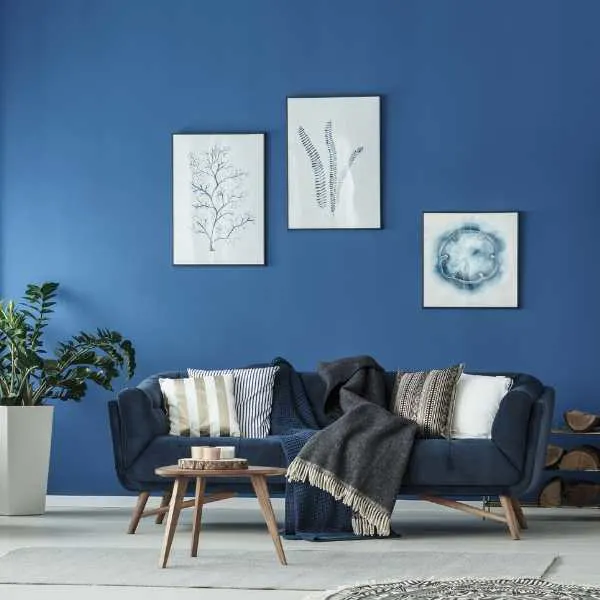
An ever-present favorite in home interiors, the on-trend shades of blue are intense and stormy, inspired by clouds, fog, the ocean, and distant hills. Blue has always been a soothing color and continues to calm and relax in our homes.
Look out for lush, saturated blues like these:
- March Wind by Pratt & Lambert
- Caribbean Sea by Glidden
- Good Jeans by Clare
- Blueberry by Benjamin Moore
A Return to Earthy Shades
Those old enough to remember the brown-is-the-new-black trend of the 1990s or even the brown and orange of the 1970s may not be enthusiastic about earthy shades. But I beg you to reconsider.
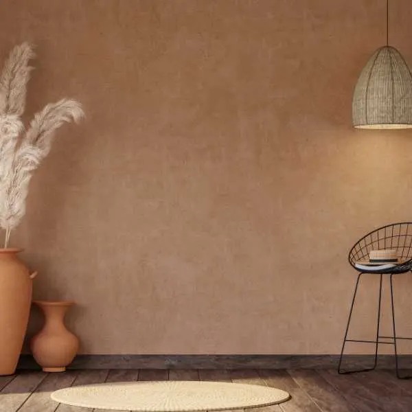
This season’s earthy shades are deliciously tactile: you’ll want to plunge your hands into these clay colors and lean your cheek against these sun-kissed walls. Rich brown, rust, terracotta, and stone shades are inspired by nature and will make your home glow.
Terracotta
This year’s version of the warm brown clay shade is almost pink, combining rich brown with on-trend purple tones. The color is nostalgic, evoking long-past holidays in Spain or Mexico, sunny afternoon siestas, and calm, peaceful interiors.
The Garden Media Group announced their color of the year for 2023 as Terracotta, referring to the beautiful pottery plant pots.
Dunn-Edwards’ color of the year is Terra Rossa, while Sherwin-Williams has chosen Redend Point. BHG’s trending color is a lighter shade, Canyon Ridge. These are warm, lush, and gorgeous for interiors and exteriors.
Other tempting shades of terracotta are:
- Piñata by Behr
- Tuscan Terracotta by Dulux
- Copper Patina by Valspar
- Terra Cotta Tile by Benjamin Moore
Greige
With the trend away from the cool greys of the past few years, greige, the warmer cousin, is making its presence felt. This mixture of grey and beige is much warmer than either of the two.
This year’s greige paint colors have a red undertone, like Dutch Boy’s color of the year, Rustic Greige.
My other favorite greige paint colors to anchor your interior are:
- Sculptor Clay by Behr
- Drop Cloth by Farrow & Ball
- Revere Pewter by Benjamin Moore
- Accessible Beige by Sherwin-Williams
Bright, Saturated Hues
Apart from the return to warm, earthy tones, there is a move to even brighter shades. Saturated, jewel-like colors will fill contemporary homes. Adventurous palettes are back, with contrasting shades combined in a single room – even on a single wall.
I love these life-affirming colors that work well with eclectic and Boho interiors, drawing inspiration from distant travels and sunnier skies.
Reds, Pinks, and Purples
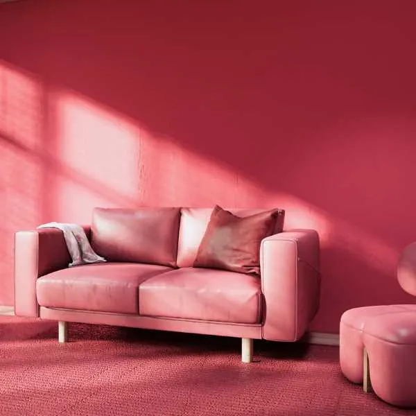
This side of the color wheel is everywhere in 2024, intensifying the blush pinks we’ve enjoyed and adding luxury and richness to interiors.
Colors range from plum to berry and wine red to watermelon pink. They’re delicious, edible colors, like Pantone’s Viva Magenta, their bold choice for the year, or Benjamin Moore’s Raspberry Blush. There is nothing subtle here: these colors are energetic, uplifting, and exciting.
My other recommendations for rosy paint colors are:
- Bamboozle by Farrow & Ball
- Vermilion by Behr
- Deep Crimson by Dunn-Edwards
- Carnelian by Sherwin-Williams
Teal
While green and blue are perenially popular, teal combines the two in a gorgeous, opulent shade that is trending in 2024. Teal appears as an anchoring shade in contemporary palettes, or as an accent, along with magenta and citrus.
Glidden has selected Vining Ivy as their color of the year. Instead of green ivy, this is rich teal, a bold, intense color saturated with blue and green.
I also love these vibrant teals:
- Blue Peacock by Sherwin-Williams
- Sophisticated Teal by Behr
- Beverly by Farrow & Ball
- Current Mood by Clare
Citrus
Yellow and orange are gloriously mood-enhancing colors that go well with the earthy tones that are popular, but also the brighter hues. These vivid colors can be used as an accent or to warm up a whole room.
Try one of these delicious paint colors:
- Goldfinch by Sherwin-Williams
- Energy Orange by Dunn-Edwards
- Citrona by Farrow & Ball
- Citrus Sachet by PPG
Monochromatic Minimalism
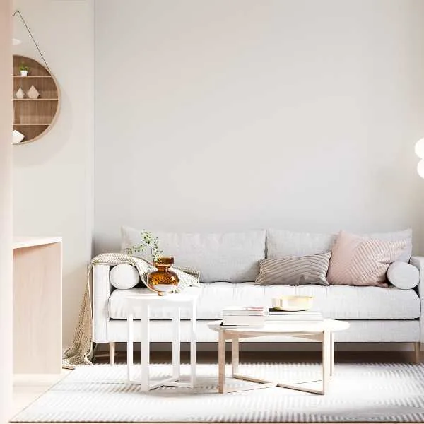
While the trend is towards a more colorful aesthetic, professional designers and homeowners often turn to neutral shades as a safe, practical option. Neutrals are, therefore, always a trend, and 2024 is no different.
With a move to a minimalist, natural lifestyle, neutral and monochrome colors have their own significance. This season’s neutrals will be warmer and earthier than the grays and beiges of the past.
Dark Neutrals
Darker neutrals are becoming more popular, with charcoal, midnight blue, and black appearing in home decor. These colors are no longer reserved for large spaces but transform smaller rooms into cozy caves that embrace you.
Feel the love with these dark neutrals:
- Goodnight Moon by Clare
- Aubergine by Behr
- Black Magic by Sherwin-Williams
- Mink by Dunn-Edwards
Light Neutrals
There is always a place for light, airy colors, which is why Behr chose the off-white Blank Canvas as their color of the year. This creamy color combines with other neutrals like greige, earthy colors, and vibrant hues that are trending.
These are also beautiful neutrals:
- Buttah by Clare
- Kestrel White by Sherwin-Williams
- Salt by Farrow & Ball
- White Heron by Benjamin Moore
Final Thoughts
The color trends for 2024 reflect our desire to embrace life. These warm, bright colors are joyous, adventurous, and exciting, although practical neutrals are trending. Natural and earthy colors, as well as intense, jewel-like shades, are set to fill our homes and brighten our moods.
Related Articles:
- Top Greige Paint Color to Improve Your Home
- 30 Best Neutral Wall Colors You’ll Love
- 11 Best Basement Ceiling Paint Colors
- Best Ceiling and Wall Paint Combinations
