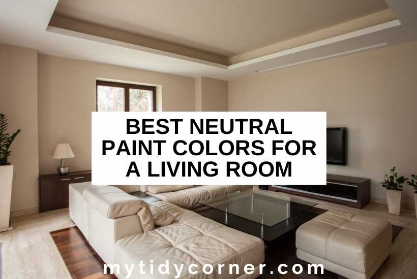
Neutrals are classic shades, whether in your wardrobe or your home. Some people prefer to layer neutral tones in their living room, but you can also use neutral colors as the backdrop for a brighter palette.
Collecting paint swatches makes you realize it’s tricky to choose between all the gorgeous neutrals available. What are the best neutral paint colors for a living room?
The best neutral paint colors for a living room harmonize tonally. White is a pure neutral. Warm tones include ivory, cream, beige, and warm taupe. Cooler neutrals are pearl, silver, light gray, tan, and taupe. Decorate with matching neutrals or use a neutral as a backdrop.

Neutrals continue to be the first step for most interior designs because they are versatile, practical, and timeless. They’re ideal for living rooms because neutrals ft seamlessly into any design trend and always look fresh and contemporary.
What are Neutral Colors in Interior Design?
In color theory, the four pure neutrals are black, white, brown, and grey, created by combining two complementary colors. However, most people use neutrals to refer to light, nearly colorless hues in interior design.
Theoretically, pure neutrals don’t have undertones. However, paint manufacturers will prove you wrong: a quick search for white paint for living rooms throws up hundreds of thousands of hits.
Experts also refer to colors as near-neutrals, which are created by combining one of the four pure colors with a primary color. These near-neutrals have obvious hue undertones. For example, tan clearly has yellow undertones, distinguishing it from pure brown.
The difference between neutrals and shades of colors (e.g., tan as opposed to light brown) isn’t sharply defined in interior design. Pale shades are often co-opted as neutrals.
Although most neutrals have low color saturation, contemporary trends in interiors are towards intensely pigmented and saturated shades.
How Do You Use Neutrals in Interiors?
Deciding to use neutrals in your living room palette offers you two choices. You can either use neutrals tonally, layering them together, or use them as background.
How to Use Neutrals Tonally
An all-neutral look is sophisticated and elegant, creating a cohesive look. If you want to layer neutral tones, consider the following:
- Choose neutrals with the same undertone. Neutrals with a yellow undertone are warmer, while those with grey undertones are cooler. The two undertones don’t harmonize well, so use your paint samples on the wall before painting.
- Incorporate natural shades in wood, brick, stone, and painted trim to add interest.
- Keep walls lighter than soft furnishings.
- Use a patterned rug to pull tones together, or select one darker than the walls.
- Include textures to stop the room from looking bland and uninviting: fluffy throws, storage baskets, and leather sofas are all options.
How to Use Neutrals as Background
Another way to use neutrals in your living room is to paint the walls a neutral shade to anchor a more vibrant palette. It’s ideal if you like to update your furnishings and accessories seasonally or with changes in fashion.
Use these questions to help you select the perfect neutral:
- Do you need a lighter neutral to make the room seem bigger?
- Do you want dark walls or an accent wall to create drama?
- Is your color scheme cool or warm?
What are the Best Neutral Paint Colors for a Living Room?
When we were planning my sister’s living room, we centered the look around a magnificent sofa upholstered in creamy raw silk. It helps to choose a first color and then work around that. Here are the neutral paint colors I recommend for living rooms.
White
White is the starting point for any neutral living room design: it remains one of the most popular choices. White is ideal for living rooms because it’s fresh, clean, and timeless. While white is achromatic, meaning it has no color and no undertone, white paints come in various white tones.
Pure White
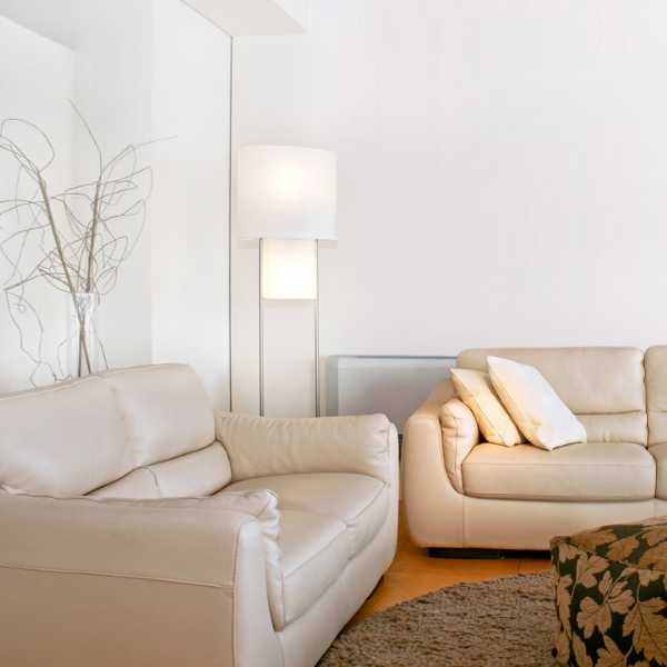

A bright, cool white is perfect for a living room with lots of sunlight. With white walls, you’re anchoring a crisp, modern, monochrome design with sleek shapes and contemporary accessories.
White is also ideal as a blank canvas for brighter accessories and artworks because it has no worrisome undertones that will destabilize the palette. You can experiment with color in your furniture and art, changing the feel of a room quickly and easily.
These are my top choices for pure white paint colors for a living room:
- Atrium White by Benjamin Moore
- Chantilly Lace by Benjamin Moore
- Snowfall White by Benjamin Moore
- Snowbound by Sherwin-Williams
Ivory

The magnificent shade of elephant tusks (where ivory belongs) is a warmer white with a slightly yellow undertone. You might call this color “off-white” as it’s just one shade away from white.
Choose ivory if your living room doesn’t get enough natural light, as it adds movement and shadows that a sterile white doesn’t. It’s close enough to pure white to create an unassuming backdrop, but I love to use ivory to infuse a tone-on-tone neutral color scheme with warmth.
Try these delicate shades of ivory:
- Wimborne White by Farrow & Ball
- Timeless by Clare
- Table Linen by Portola Paints
- Ivory Tusk by Benjamin Moore
Cream

The difference between cream and ivory is the strength of the yellow undertone. Cream is a richer, warmer color than ivory, with some shades verging on pale, buttery yellow.
It works well with traditional and vintage-style interiors, dark wood furniture, and rich brown furnishings.
Choose one of these warm, lush cream paints:
- White Tie by Farrow & Ball
- Natural Linen by Sherwin-Williams
- Vanilla Milkshake by Benjamin Moore
- Swiss Coffee by Behr
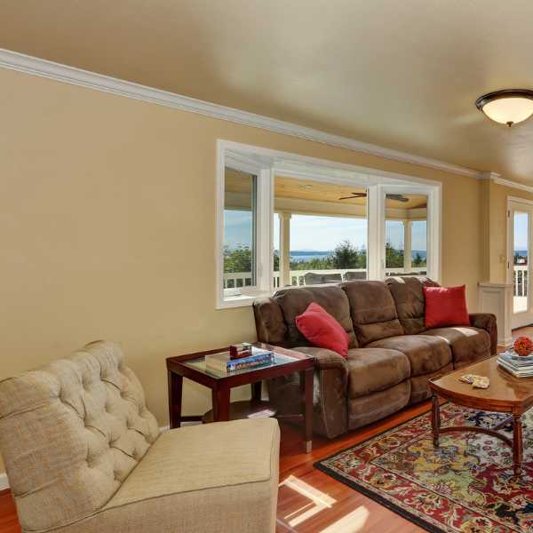
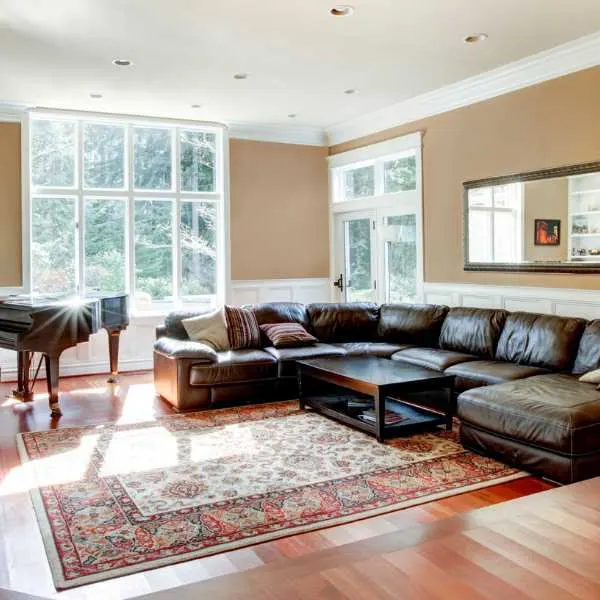
Beige
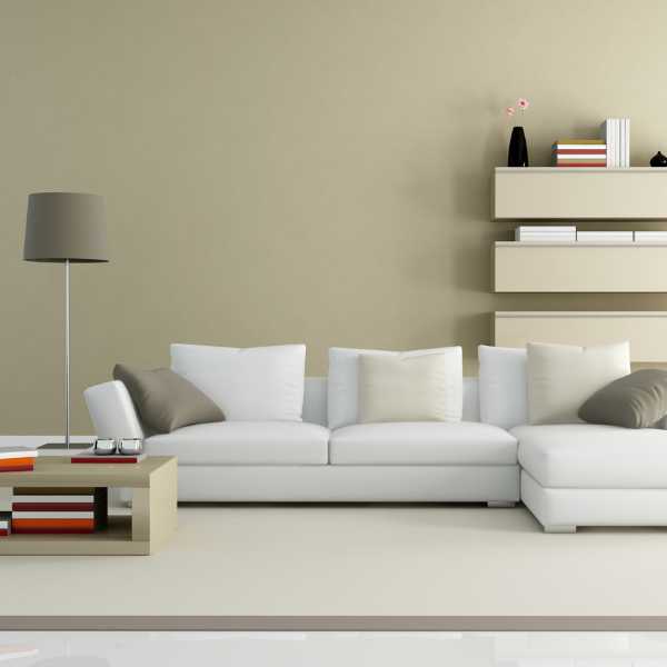
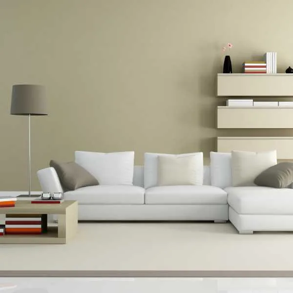
Technically, beige is a shade of white, but this gorgeous neutral is a color in its own right. If you have cream and add a hint of brown, you’ll have beige.
At its lightest, beige is a natural color, like raw linen or calico cotton. Darker beige can verge on tan or brown, depending on how much yellow it has in it.
Ideally, beige should have a warm undertone, making it an excellent partner for rust, red, and brown color schemes. However, it shouldn’t shine yellow under artificial light.
These are my favorite beige paint colors:
- Bleeker Beige by Benjamin Moore
- Shaker Beige by Benjamin Moore
- Navajo White by Sherwin-Williams
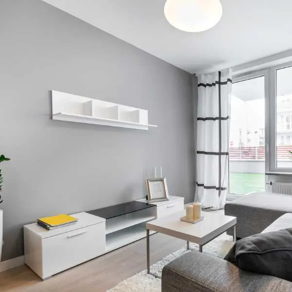
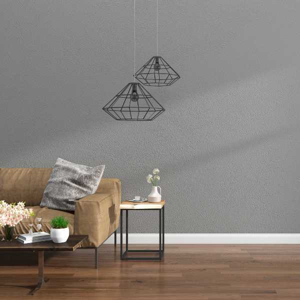
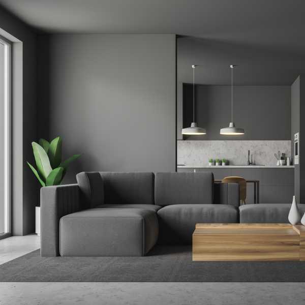
Gray
One of the most popular neutrals for interiors over the past few years, grey remains a favorite choice for living rooms. The range of gray paints available is vast, so ensure their undertones harmonize. Gray can have a blue, green, or yellow undertone that will appear against other shades.
Pearl Gray

This is the lightest of grays, creating a neutral wall that plays delightfully with light. It reflects and accentuates natural light, shimmering with iridescent colors. It’s a sophisticated, elegant color for classic interiors and works well with toning grays and delicate colors.
The best pearl gray options are:
- Ammonite by Farrow & Ball
- Marilyn’s Dress by Benjamin Moore
- Classic Gray by Benjamin Moore
- Penthouse by Clare
Silver Gray

A true gray is achromatic, combining pure white and pure black. Light gray is clear and cool, adding light to any space.
Use silver gray with white for traditional elegance or as a background for a contemporary living room showcasing your collection of abstract art. Silver gray’s effect is fresh and serene – don’t use this for a comfortable, rustic family room.
These are the staple light grays:
- Passive by Sherwin-Williams
- Silvery Moon by PPG
- Sterling by Benjamin Moore
- Silver Satin by Benjamin Moore
Pewter

This delectable gray has elements of silver tempered by charcoal. The most beautiful shades of pewter paint have cool blue undertones. Those with yellower undertones are in greige territory.
Pewter is a more dramatic neutral and works well with eclectic, Bohemian, and vintage interiors. If you’re nervous that it’s too dark a gray, use it for an accent wall.
These are the best pewter paint colors for neutral schemes:
- Revere Pewter by Benjamin Moore
- Pewter by Valspar
- Pewter Cast by Sherwin-Williams
- Pewter Mug by Behr
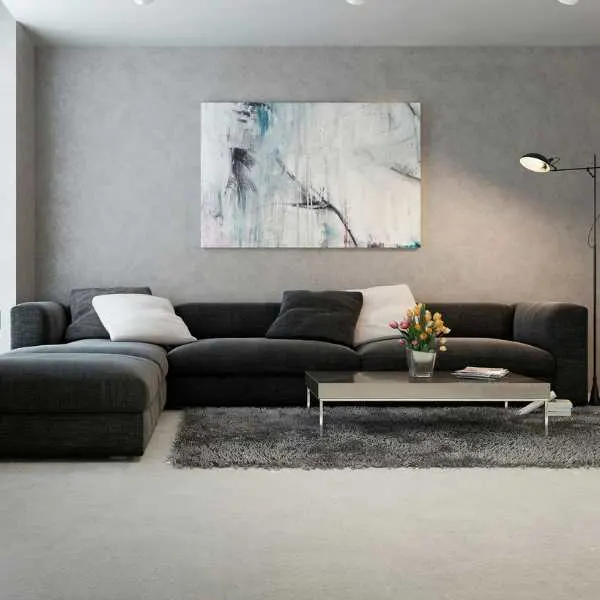
Charcoal

While actual charcoal is black, the color in interior design can refer to any shade between black and dark gray. Black can be a powerful neutral, but not for a living room as it can easily make it dark and poky instead of relaxing.
Charcoal is a stormy, moody gray, which some feel disqualifies it as neutral. However, it creates a dramatic backdrop that you can dress as you please, whether coastal or English library.
- Dovetail by Sherwin-Williams
- Downpipe by Farrow & Ball
- Graphic Charcoal by Behr
- Chelsea Grey by Benjamin Moore
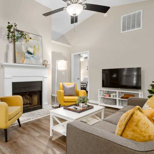
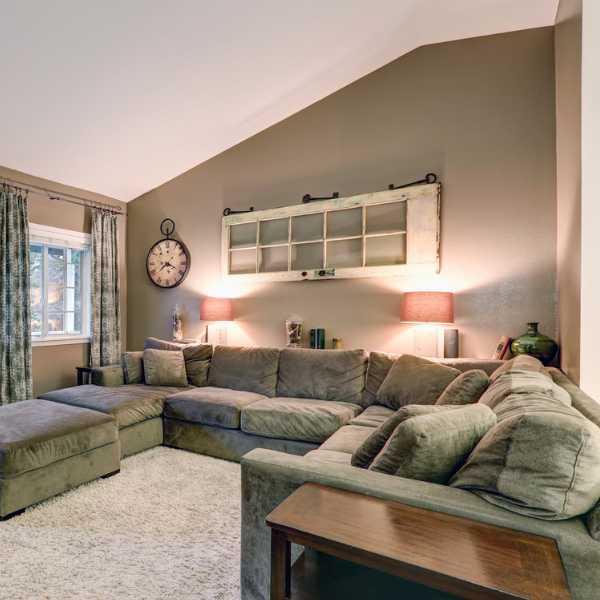
Greige

This rich, tactile shade is the love child of beige and gray. It’s rich in color, warm from the beige, and soft from the grey undertones. Greige ranges from beige with a gray tone to thunderous grays with a hint of yellow.
It looks great in every room of the house, from kitchen cabinets to home office. The joy of greige is that it can look elegant and glamorous, accessorized with glass and metal, or underpin an inviting farmhouse aesthetic. (Here are more farmhouse colors.)
It’s a tough choice, but these are my go-to greiges:
- Rustic Greige by Dutch Boy
- Agreeable Grey by Sherwin-Williams
- Sculptor Clay by Behr
- Drop Cloth by Farrow & Ball
Tan
Tan is an example of a neutral that is a pure neutral’s shade: tan is a mixture between white and brown. The best tan paints are rich and smooth, warming up a room and making it cozy. I love tan in family living rooms filled with rustic wood, comfortable leather, and natural accessories (like a sisal rug).
It’s also a fantastic backdrop to mid century, vintage, and modernist interiors.
I recommend these beautiful tans:
- Cord by Farrow & Ball
- Paper Sack by Dunn-Edwards
- Coastal Path by Benjamin Moore
- Tamarind by Sherwin-Williams
Taupe

Probably one of the most challenging colors to describe, taupe combines gray and brown but with warm, almost pinkish undertones. It’s not as yellow as tan, but not as gray as greige – if that’s any help!
Taupe is the color to choose if you dream of a crumbling farmhouse in Italy with faded terracotta walls and wandering vines. It lends itself to a gently pink and white color scheme, adding depth to an otherwise neutral room.
Try these gorgeous taupe shades:
- Redend Point by Sherwin-Williams
- Loggia by Sherwin-Williams
- Emerging Taupe by Sherwin-Williams
Final Thoughts
Neutrals are the interior designer’s best friend, as they make a great starting point for any color palette or aesthetic. These shades range from pure white to dramatic charcoal and can layer together for a tonal look or form a blank canvas for more vibrant colors.
Related Articles:
- 10 Best Calming Paint Colors for the Bedroom
- 9 Best Living Room Curtain Colors
- Best Color to Paint a South Facing Room
- 30 Best Blue Gray Paint Colors
- 10 Best Blue Gray Paint Colors from Sherwin Williams
- Top 12 Dining Room Paint Colors

